 |
Qt 4.8
|
|
Qt 4.8
|
The ListView item provides a list view of items provided by a model. More...
The ListView item provides a list view of items provided by a model.
A ListView displays data from models created from built-in QML elements like ListModel and XmlListModel, or custom model classes defined in C++ that inherit from QAbstractListModel.
A ListView has a model , which defines the data to be displayed, and a delegate , which defines how the data should be displayed. Items in a ListView are laid out horizontally or vertically. List views are inherently flickable because ListView inherits from Flickable .
The following example shows the definition of a simple list model defined in a file called ContactModel.qml:
Another component can display this model data in a ListView, like this:
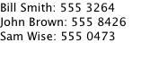
Here, the ListView creates a ContactModel component for its model, and a Text element for its delegate. The view will create a new Text component for each item in the model. Notice the delegate is able to access the model's name and number data directly.
An improved list view is shown below. The delegate is visually improved and is moved into a separate contactDelegate component.
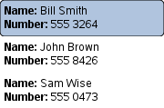
The currently selected item is highlighted with a blue Rectangle using the highlight property, and focus is set to true to enable keyboard navigation for the list view. The list view itself is a focus scope (see the focus documentation page for more details).
Delegates are instantiated as needed and may be destroyed at any time. State should never be stored in a delegate.
ListView attaches a number of properties to the root item of the delegate, for example {ListView.isCurrentItem}. In the following example, the root delegate item can access this attached property directly as ListView.isCurrentItem, while the child contactInfo object must refer to this property as wrapper.ListView.isCurrentItem.