Qt 4.8
Public Types | Public Functions | Static Public Functions | Protected Slots | Protected Functions | Private Functions | Friends | List of all members
QStyle Class Referenceabstract

The QStyle class is an abstract base class that encapsulates the look and feel of a GUI. More...

#include <qstyle.h>

Inheritance diagram for QStyle:
QObject QCommonStyle QMotifStyle QProxyStyle QWindowsStyle QCDEStyle QCleanlooksStyle QMacStyle QPlastiqueStyle QStyleSheetStyle QWindowsCEStyle QWindowsMobileStyle QWindowsXPStyle

Public Types

enum  ComplexControl {
  CC_SpinBox, CC_ComboBox, CC_ScrollBar, CC_Slider,
  CC_ToolButton, CC_TitleBar, CC_Q3ListView, CC_Dial,
  CC_GroupBox, CC_MdiControls, CC_CustomBase = 0xf0000000
}
 This enum describes the available complex controls. More...
 
enum  ContentsType {
  CT_PushButton, CT_CheckBox, CT_RadioButton, CT_ToolButton,
  CT_ComboBox, CT_Splitter, CT_Q3DockWindow, CT_ProgressBar,
  CT_MenuItem, CT_MenuBarItem, CT_MenuBar, CT_Menu,
  CT_TabBarTab, CT_Slider, CT_ScrollBar, CT_Q3Header,
  CT_LineEdit, CT_SpinBox, CT_SizeGrip, CT_TabWidget,
  CT_DialogButtons, CT_HeaderSection, CT_GroupBox, CT_MdiControls,
  CT_ItemViewItem, CT_CustomBase = 0xf0000000
}
 This enum describes the available contents types. More...
 
enum  ControlElement {
  CE_PushButton, CE_PushButtonBevel, CE_PushButtonLabel, CE_CheckBox,
  CE_CheckBoxLabel, CE_RadioButton, CE_RadioButtonLabel, CE_TabBarTab,
  CE_TabBarTabShape, CE_TabBarTabLabel, CE_ProgressBar, CE_ProgressBarGroove,
  CE_ProgressBarContents, CE_ProgressBarLabel, CE_MenuItem, CE_MenuScroller,
  CE_MenuVMargin, CE_MenuHMargin, CE_MenuTearoff, CE_MenuEmptyArea,
  CE_MenuBarItem, CE_MenuBarEmptyArea, CE_ToolButtonLabel, CE_Header,
  CE_HeaderSection, CE_HeaderLabel, CE_Q3DockWindowEmptyArea, CE_ToolBoxTab,
  CE_SizeGrip, CE_Splitter, CE_RubberBand, CE_DockWidgetTitle,
  CE_ScrollBarAddLine, CE_ScrollBarSubLine, CE_ScrollBarAddPage, CE_ScrollBarSubPage,
  CE_ScrollBarSlider, CE_ScrollBarFirst, CE_ScrollBarLast, CE_FocusFrame,
  CE_ComboBoxLabel, CE_ToolBar, CE_ToolBoxTabShape, CE_ToolBoxTabLabel,
  CE_HeaderEmptyArea, CE_ColumnViewGrip, CE_ItemViewItem, CE_ShapedFrame,
  CE_CustomBase = 0xf0000000
}
 This enum represents a control element. More...
 
enum  PixelMetric {
  PM_ButtonMargin, PM_ButtonDefaultIndicator, PM_MenuButtonIndicator, PM_ButtonShiftHorizontal,
  PM_ButtonShiftVertical, PM_DefaultFrameWidth, PM_SpinBoxFrameWidth, PM_ComboBoxFrameWidth,
  PM_MaximumDragDistance, PM_ScrollBarExtent, PM_ScrollBarSliderMin, PM_SliderThickness,
  PM_SliderControlThickness, PM_SliderLength, PM_SliderTickmarkOffset, PM_SliderSpaceAvailable,
  PM_DockWidgetSeparatorExtent, PM_DockWidgetHandleExtent, PM_DockWidgetFrameWidth, PM_TabBarTabOverlap,
  PM_TabBarTabHSpace, PM_TabBarTabVSpace, PM_TabBarBaseHeight, PM_TabBarBaseOverlap,
  PM_ProgressBarChunkWidth, PM_SplitterWidth, PM_TitleBarHeight, PM_MenuScrollerHeight,
  PM_MenuHMargin, PM_MenuVMargin, PM_MenuPanelWidth, PM_MenuTearoffHeight,
  PM_MenuDesktopFrameWidth, PM_MenuBarPanelWidth, PM_MenuBarItemSpacing, PM_MenuBarVMargin,
  PM_MenuBarHMargin, PM_IndicatorWidth, PM_IndicatorHeight, PM_ExclusiveIndicatorWidth,
  PM_ExclusiveIndicatorHeight, PM_CheckListButtonSize, PM_CheckListControllerSize, PM_DialogButtonsSeparator,
  PM_DialogButtonsButtonWidth, PM_DialogButtonsButtonHeight, PM_MdiSubWindowFrameWidth, PM_MDIFrameWidth = PM_MdiSubWindowFrameWidth,
  PM_MdiSubWindowMinimizedWidth, PM_MDIMinimizedWidth = PM_MdiSubWindowMinimizedWidth, PM_HeaderMargin, PM_HeaderMarkSize,
  PM_HeaderGripMargin, PM_TabBarTabShiftHorizontal, PM_TabBarTabShiftVertical, PM_TabBarScrollButtonWidth,
  PM_ToolBarFrameWidth, PM_ToolBarHandleExtent, PM_ToolBarItemSpacing, PM_ToolBarItemMargin,
  PM_ToolBarSeparatorExtent, PM_ToolBarExtensionExtent, PM_SpinBoxSliderHeight, PM_DefaultTopLevelMargin,
  PM_DefaultChildMargin, PM_DefaultLayoutSpacing, PM_ToolBarIconSize, PM_ListViewIconSize,
  PM_IconViewIconSize, PM_SmallIconSize, PM_LargeIconSize, PM_FocusFrameVMargin,
  PM_FocusFrameHMargin, PM_ToolTipLabelFrameWidth, PM_CheckBoxLabelSpacing, PM_TabBarIconSize,
  PM_SizeGripSize, PM_DockWidgetTitleMargin, PM_MessageBoxIconSize, PM_ButtonIconSize,
  PM_DockWidgetTitleBarButtonMargin, PM_RadioButtonLabelSpacing, PM_LayoutLeftMargin, PM_LayoutTopMargin,
  PM_LayoutRightMargin, PM_LayoutBottomMargin, PM_LayoutHorizontalSpacing, PM_LayoutVerticalSpacing,
  PM_TabBar_ScrollButtonOverlap, PM_TextCursorWidth, PM_TabCloseIndicatorWidth, PM_TabCloseIndicatorHeight,
  PM_ScrollView_ScrollBarSpacing, PM_SubMenuOverlap, PM_CustomBase = 0xf0000000
}
 This enum describes the various available pixel metrics. More...
 
enum  PrimitiveElement {
  PE_Q3CheckListController, PE_Q3CheckListExclusiveIndicator, PE_Q3CheckListIndicator, PE_Q3DockWindowSeparator,
  PE_Q3Separator, PE_Frame, PE_FrameDefaultButton, PE_FrameDockWidget,
  PE_FrameFocusRect, PE_FrameGroupBox, PE_FrameLineEdit, PE_FrameMenu,
  PE_FrameStatusBar, PE_FrameStatusBarItem = PE_FrameStatusBar, PE_FrameTabWidget, PE_FrameWindow,
  PE_FrameButtonBevel, PE_FrameButtonTool, PE_FrameTabBarBase, PE_PanelButtonCommand,
  PE_PanelButtonBevel, PE_PanelButtonTool, PE_PanelMenuBar, PE_PanelToolBar,
  PE_PanelLineEdit, PE_IndicatorArrowDown, PE_IndicatorArrowLeft, PE_IndicatorArrowRight,
  PE_IndicatorArrowUp, PE_IndicatorBranch, PE_IndicatorButtonDropDown, PE_IndicatorViewItemCheck,
  PE_IndicatorItemViewItemCheck = PE_IndicatorViewItemCheck, PE_IndicatorCheckBox, PE_IndicatorDockWidgetResizeHandle, PE_IndicatorHeaderArrow,
  PE_IndicatorMenuCheckMark, PE_IndicatorProgressChunk, PE_IndicatorRadioButton, PE_IndicatorSpinDown,
  PE_IndicatorSpinMinus, PE_IndicatorSpinPlus, PE_IndicatorSpinUp, PE_IndicatorToolBarHandle,
  PE_IndicatorToolBarSeparator, PE_PanelTipLabel, PE_IndicatorTabTear, PE_PanelScrollAreaCorner,
  PE_Widget, PE_IndicatorColumnViewArrow, PE_IndicatorItemViewItemDrop, PE_PanelItemViewItem,
  PE_PanelItemViewRow, PE_PanelStatusBar, PE_IndicatorTabClose, PE_PanelMenu,
  PE_CustomBase = 0xf000000
}
 This enum describes the various primitive elements. More...
 
enum  RequestSoftwareInputPanel { RSIP_OnMouseClickAndAlreadyFocused, RSIP_OnMouseClick }
 This enum describes under what circumstances a software input panel will be requested by input capable widgets. More...
 
enum  StandardPixmap {
  SP_TitleBarMenuButton, SP_TitleBarMinButton, SP_TitleBarMaxButton, SP_TitleBarCloseButton,
  SP_TitleBarNormalButton, SP_TitleBarShadeButton, SP_TitleBarUnshadeButton, SP_TitleBarContextHelpButton,
  SP_DockWidgetCloseButton, SP_MessageBoxInformation, SP_MessageBoxWarning, SP_MessageBoxCritical,
  SP_MessageBoxQuestion, SP_DesktopIcon, SP_TrashIcon, SP_ComputerIcon,
  SP_DriveFDIcon, SP_DriveHDIcon, SP_DriveCDIcon, SP_DriveDVDIcon,
  SP_DriveNetIcon, SP_DirOpenIcon, SP_DirClosedIcon, SP_DirLinkIcon,
  SP_FileIcon, SP_FileLinkIcon, SP_ToolBarHorizontalExtensionButton, SP_ToolBarVerticalExtensionButton,
  SP_FileDialogStart, SP_FileDialogEnd, SP_FileDialogToParent, SP_FileDialogNewFolder,
  SP_FileDialogDetailedView, SP_FileDialogInfoView, SP_FileDialogContentsView, SP_FileDialogListView,
  SP_FileDialogBack, SP_DirIcon, SP_DialogOkButton, SP_DialogCancelButton,
  SP_DialogHelpButton, SP_DialogOpenButton, SP_DialogSaveButton, SP_DialogCloseButton,
  SP_DialogApplyButton, SP_DialogResetButton, SP_DialogDiscardButton, SP_DialogYesButton,
  SP_DialogNoButton, SP_ArrowUp, SP_ArrowDown, SP_ArrowLeft,
  SP_ArrowRight, SP_ArrowBack, SP_ArrowForward, SP_DirHomeIcon,
  SP_CommandLink, SP_VistaShield, SP_BrowserReload, SP_BrowserStop,
  SP_MediaPlay, SP_MediaStop, SP_MediaPause, SP_MediaSkipForward,
  SP_MediaSkipBackward, SP_MediaSeekForward, SP_MediaSeekBackward, SP_MediaVolume,
  SP_MediaVolumeMuted, SP_CustomBase = 0xf0000000
}
 This enum describes the available standard pixmaps. More...
 
enum  StateFlag {
  State_None = 0x00000000, State_Enabled = 0x00000001, State_Raised = 0x00000002, State_Sunken = 0x00000004,
  State_Off = 0x00000008, State_NoChange = 0x00000010, State_On = 0x00000020, State_DownArrow = 0x00000040,
  State_Horizontal = 0x00000080, State_HasFocus = 0x00000100, State_Top = 0x00000200, State_Bottom = 0x00000400,
  State_FocusAtBorder = 0x00000800, State_AutoRaise = 0x00001000, State_MouseOver = 0x00002000, State_UpArrow = 0x00004000,
  State_Selected = 0x00008000, State_Active = 0x00010000, State_Window = 0x00020000, State_Open = 0x00040000,
  State_Children = 0x00080000, State_Item = 0x00100000, State_Sibling = 0x00200000, State_Editing = 0x00400000,
  State_KeyboardFocusChange = 0x00800000, State_ReadOnly = 0x02000000, State_Small = 0x04000000, State_Mini = 0x08000000
}
 This enum describes flags that are used when drawing primitive elements. More...
 
enum  StyleHint {
  SH_EtchDisabledText, SH_DitherDisabledText, SH_ScrollBar_MiddleClickAbsolutePosition, SH_ScrollBar_ScrollWhenPointerLeavesControl,
  SH_TabBar_SelectMouseType, SH_TabBar_Alignment, SH_Header_ArrowAlignment, SH_Slider_SnapToValue,
  SH_Slider_SloppyKeyEvents, SH_ProgressDialog_CenterCancelButton, SH_ProgressDialog_TextLabelAlignment, SH_PrintDialog_RightAlignButtons,
  SH_MainWindow_SpaceBelowMenuBar, SH_FontDialog_SelectAssociatedText, SH_Menu_AllowActiveAndDisabled, SH_Menu_SpaceActivatesItem,
  SH_Menu_SubMenuPopupDelay, SH_ScrollView_FrameOnlyAroundContents, SH_MenuBar_AltKeyNavigation, SH_ComboBox_ListMouseTracking,
  SH_Menu_MouseTracking, SH_MenuBar_MouseTracking, SH_ItemView_ChangeHighlightOnFocus, SH_Widget_ShareActivation,
  SH_Workspace_FillSpaceOnMaximize, SH_ComboBox_Popup, SH_TitleBar_NoBorder, SH_Slider_StopMouseOverSlider,
  SH_ScrollBar_StopMouseOverSlider = SH_Slider_StopMouseOverSlider, SH_BlinkCursorWhenTextSelected, SH_RichText_FullWidthSelection, SH_Menu_Scrollable,
  SH_GroupBox_TextLabelVerticalAlignment, SH_GroupBox_TextLabelColor, SH_Menu_SloppySubMenus, SH_Table_GridLineColor,
  SH_LineEdit_PasswordCharacter, SH_DialogButtons_DefaultButton, SH_ToolBox_SelectedPageTitleBold, SH_TabBar_PreferNoArrows,
  SH_ScrollBar_LeftClickAbsolutePosition, SH_Q3ListViewExpand_SelectMouseType, SH_UnderlineShortcut, SH_SpinBox_AnimateButton,
  SH_SpinBox_KeyPressAutoRepeatRate, SH_SpinBox_ClickAutoRepeatRate, SH_Menu_FillScreenWithScroll, SH_ToolTipLabel_Opacity,
  SH_DrawMenuBarSeparator, SH_TitleBar_ModifyNotification, SH_Button_FocusPolicy, SH_MenuBar_DismissOnSecondClick,
  SH_MessageBox_UseBorderForButtonSpacing, SH_TitleBar_AutoRaise, SH_ToolButton_PopupDelay, SH_FocusFrame_Mask,
  SH_RubberBand_Mask, SH_WindowFrame_Mask, SH_SpinControls_DisableOnBounds, SH_Dial_BackgroundRole,
  SH_ComboBox_LayoutDirection, SH_ItemView_EllipsisLocation, SH_ItemView_ShowDecorationSelected, SH_ItemView_ActivateItemOnSingleClick,
  SH_ScrollBar_ContextMenu, SH_ScrollBar_RollBetweenButtons, SH_Slider_AbsoluteSetButtons, SH_Slider_PageSetButtons,
  SH_Menu_KeyboardSearch, SH_TabBar_ElideMode, SH_DialogButtonLayout, SH_ComboBox_PopupFrameStyle,
  SH_MessageBox_TextInteractionFlags, SH_DialogButtonBox_ButtonsHaveIcons, SH_SpellCheckUnderlineStyle, SH_MessageBox_CenterButtons,
  SH_Menu_SelectionWrap, SH_ItemView_MovementWithoutUpdatingSelection, SH_ToolTip_Mask, SH_FocusFrame_AboveWidget,
  SH_TextControl_FocusIndicatorTextCharFormat, SH_WizardStyle, SH_ItemView_ArrowKeysNavigateIntoChildren, SH_Menu_Mask,
  SH_Menu_FlashTriggeredItem, SH_Menu_FadeOutOnHide, SH_SpinBox_ClickAutoRepeatThreshold, SH_ItemView_PaintAlternatingRowColorsForEmptyArea,
  SH_FormLayoutWrapPolicy, SH_TabWidget_DefaultTabPosition, SH_ToolBar_Movable, SH_FormLayoutFieldGrowthPolicy,
  SH_FormLayoutFormAlignment, SH_FormLayoutLabelAlignment, SH_ItemView_DrawDelegateFrame, SH_TabBar_CloseButtonPosition,
  SH_DockWidget_ButtonsHaveFrame, SH_ToolButtonStyle, SH_RequestSoftwareInputPanel, SH_CustomBase = 0xf0000000
}
 This enum describes the available style hints. More...
 
enum  SubControl {
  SC_None = 0x00000000, SC_ScrollBarAddLine = 0x00000001, SC_ScrollBarSubLine = 0x00000002, SC_ScrollBarAddPage = 0x00000004,
  SC_ScrollBarSubPage = 0x00000008, SC_ScrollBarFirst = 0x00000010, SC_ScrollBarLast = 0x00000020, SC_ScrollBarSlider = 0x00000040,
  SC_ScrollBarGroove = 0x00000080, SC_SpinBoxUp = 0x00000001, SC_SpinBoxDown = 0x00000002, SC_SpinBoxFrame = 0x00000004,
  SC_SpinBoxEditField = 0x00000008, SC_ComboBoxFrame = 0x00000001, SC_ComboBoxEditField = 0x00000002, SC_ComboBoxArrow = 0x00000004,
  SC_ComboBoxListBoxPopup = 0x00000008, SC_SliderGroove = 0x00000001, SC_SliderHandle = 0x00000002, SC_SliderTickmarks = 0x00000004,
  SC_ToolButton = 0x00000001, SC_ToolButtonMenu = 0x00000002, SC_TitleBarSysMenu = 0x00000001, SC_TitleBarMinButton = 0x00000002,
  SC_TitleBarMaxButton = 0x00000004, SC_TitleBarCloseButton = 0x00000008, SC_TitleBarNormalButton = 0x00000010, SC_TitleBarShadeButton = 0x00000020,
  SC_TitleBarUnshadeButton = 0x00000040, SC_TitleBarContextHelpButton = 0x00000080, SC_TitleBarLabel = 0x00000100, SC_Q3ListView = 0x00000001,
  SC_Q3ListViewBranch = 0x00000002, SC_Q3ListViewExpand = 0x00000004, SC_DialGroove = 0x00000001, SC_DialHandle = 0x00000002,
  SC_DialTickmarks = 0x00000004, SC_GroupBoxCheckBox = 0x00000001, SC_GroupBoxLabel = 0x00000002, SC_GroupBoxContents = 0x00000004,
  SC_GroupBoxFrame = 0x00000008, SC_MdiMinButton = 0x00000001, SC_MdiNormalButton = 0x00000002, SC_MdiCloseButton = 0x00000004,
  SC_CustomBase = 0xf0000000, SC_All = 0xffffffff
}
 This enum describes the available sub controls. More...
 
enum  SubElement {
  SE_PushButtonContents, SE_PushButtonFocusRect, SE_CheckBoxIndicator, SE_CheckBoxContents,
  SE_CheckBoxFocusRect, SE_CheckBoxClickRect, SE_RadioButtonIndicator, SE_RadioButtonContents,
  SE_RadioButtonFocusRect, SE_RadioButtonClickRect, SE_ComboBoxFocusRect, SE_SliderFocusRect,
  SE_Q3DockWindowHandleRect, SE_ProgressBarGroove, SE_ProgressBarContents, SE_ProgressBarLabel,
  SE_DialogButtonAccept, SE_DialogButtonReject, SE_DialogButtonApply, SE_DialogButtonHelp,
  SE_DialogButtonAll, SE_DialogButtonAbort, SE_DialogButtonIgnore, SE_DialogButtonRetry,
  SE_DialogButtonCustom, SE_ToolBoxTabContents, SE_HeaderLabel, SE_HeaderArrow,
  SE_TabWidgetTabBar, SE_TabWidgetTabPane, SE_TabWidgetTabContents, SE_TabWidgetLeftCorner,
  SE_TabWidgetRightCorner, SE_ViewItemCheckIndicator, SE_ItemViewItemCheckIndicator = SE_ViewItemCheckIndicator, SE_TabBarTearIndicator,
  SE_TreeViewDisclosureItem, SE_LineEditContents, SE_FrameContents, SE_DockWidgetCloseButton,
  SE_DockWidgetFloatButton, SE_DockWidgetTitleBarText, SE_DockWidgetIcon, SE_CheckBoxLayoutItem,
  SE_ComboBoxLayoutItem, SE_DateTimeEditLayoutItem, SE_DialogButtonBoxLayoutItem, SE_LabelLayoutItem,
  SE_ProgressBarLayoutItem, SE_PushButtonLayoutItem, SE_RadioButtonLayoutItem, SE_SliderLayoutItem,
  SE_SpinBoxLayoutItem, SE_ToolButtonLayoutItem, SE_FrameLayoutItem, SE_GroupBoxLayoutItem,
  SE_TabWidgetLayoutItem, SE_ItemViewItemDecoration, SE_ItemViewItemText, SE_ItemViewItemFocusRect,
  SE_TabBarTabLeftButton, SE_TabBarTabRightButton, SE_TabBarTabText, SE_ShapedFrameContents,
  SE_ToolBarHandle, SE_CustomBase = 0xf0000000
}
 This enum represents a sub-area of a widget. More...
 

Public Functions

int combinedLayoutSpacing (QSizePolicy::ControlTypes controls1, QSizePolicy::ControlTypes controls2, Qt::Orientation orientation, QStyleOption *option=0, QWidget *widget=0) const
 Returns the spacing that should be used between controls1 and controls2 in a layout. More...
 
virtual void drawComplexControl (ComplexControl cc, const QStyleOptionComplex *opt, QPainter *p, const QWidget *widget=0) const =0
 Draws the given control using the provided painter with the style options specified by option. More...
 
virtual void drawControl (ControlElement element, const QStyleOption *opt, QPainter *p, const QWidget *w=0) const =0
 Draws the given element with the provided painter with the style options specified by option. More...
 
virtual void drawItemPixmap (QPainter *painter, const QRect &rect, int alignment, const QPixmap &pixmap) const
 Draws the given pixmap in the specified rectangle, according to the specified alignment, using the provided painter. More...
 
virtual void drawItemText (QPainter *painter, const QRect &rect, int flags, const QPalette &pal, bool enabled, const QString &text, QPalette::ColorRole textRole=QPalette::NoRole) const
 Draws the given text in the specified rectangle using the provided painter and palette. More...
 
virtual void drawPrimitive (PrimitiveElement pe, const QStyleOption *opt, QPainter *p, const QWidget *w=0) const =0
 Draws the given primitive element with the provided painter using the style options specified by option. More...
 
virtual QPixmap generatedIconPixmap (QIcon::Mode iconMode, const QPixmap &pixmap, const QStyleOption *opt) const =0
 Returns a copy of the given pixmap, styled to conform to the specified iconMode and taking into account the palette specified by option. More...
 
virtual SubControl hitTestComplexControl (ComplexControl cc, const QStyleOptionComplex *opt, const QPoint &pt, const QWidget *widget=0) const =0
 Returns the sub control at the given position in the given complex control (with the style options specified by option). More...
 
virtual QRect itemPixmapRect (const QRect &r, int flags, const QPixmap &pixmap) const
 Returns the area within the given rectangle in which to draw the specified pixmap according to the defined alignment. More...
 
virtual QRect itemTextRect (const QFontMetrics &fm, const QRect &r, int flags, bool enabled, const QString &text) const
 Returns the area within the given rectangle in which to draw the provided text according to the specified font metrics and alignment. More...
 
int layoutSpacing (QSizePolicy::ControlType control1, QSizePolicy::ControlType control2, Qt::Orientation orientation, const QStyleOption *option=0, const QWidget *widget=0) const
 Returns the spacing that should be used between control1 and control2 in a layout. More...
 
virtual int pixelMetric (PixelMetric metric, const QStyleOption *option=0, const QWidget *widget=0) const =0
 Returns the value of the given pixel metric. More...
 
virtual void polish (QWidget *)
 Initializes the appearance of the given widget. More...
 
virtual void polish (QApplication *)
 This is an overloaded member function, provided for convenience. It differs from the above function only in what argument(s) it accepts.Late initialization of the given application object. More...
 
virtual void polish (QPalette &)
 Changes the palette according to style specific requirements for color palettes (if any). More...
 
const QStyleproxy () const
 
 QStyle ()
 Constructs a style object. More...
 
virtual QSize sizeFromContents (ContentsType ct, const QStyleOption *opt, const QSize &contentsSize, const QWidget *w=0) const =0
 Returns the size of the element described by the specified option and type, based on the provided contentsSize. More...
 
QIcon standardIcon (StandardPixmap standardIcon, const QStyleOption *option=0, const QWidget *widget=0) const
 Returns an icon for the given standardIcon. More...
 
virtual QPalette standardPalette () const
 Returns the style's standard palette. More...
 
virtual QPixmap standardPixmap (StandardPixmap standardPixmap, const QStyleOption *opt=0, const QWidget *widget=0) const =0
 
virtual int styleHint (StyleHint stylehint, const QStyleOption *opt=0, const QWidget *widget=0, QStyleHintReturn *returnData=0) const =0
 Returns an integer representing the specified style hint for the given widget described by the provided style option. More...
 
virtual QRect subControlRect (ComplexControl cc, const QStyleOptionComplex *opt, SubControl sc, const QWidget *widget=0) const =0
 Returns the rectangle containing the specified subControl of the given complex control (with the style specified by option). More...
 
virtual QRect subElementRect (SubElement subElement, const QStyleOption *option, const QWidget *widget=0) const =0
 Returns the sub-area for the given element as described in the provided style option. More...
 
virtual void unpolish (QWidget *)
 Uninitialize the given {widget}'s appearance. More...
 
virtual void unpolish (QApplication *)
 This is an overloaded member function, provided for convenience. It differs from the above function only in what argument(s) it accepts.Uninitialize the given application. More...
 
virtual ~QStyle ()
 Destroys the style object. More...
 
- Public Functions inherited from QObject
bool blockSignals (bool b)
 If block is true, signals emitted by this object are blocked (i.e., emitting a signal will not invoke anything connected to it). More...
 
const QObjectListchildren () const
 Returns a list of child objects. More...
 
bool connect (const QObject *sender, const char *signal, const char *member, Qt::ConnectionType type=Qt::AutoConnection) const
 
bool disconnect (const char *signal=0, const QObject *receiver=0, const char *member=0)
 
bool disconnect (const QObject *receiver, const char *member=0)
 
void dumpObjectInfo ()
 Dumps information about signal connections, etc. More...
 
void dumpObjectTree ()
 Dumps a tree of children to the debug output. More...
 
QList< QByteArraydynamicPropertyNames () const
 Returns the names of all properties that were dynamically added to the object using setProperty(). More...
 
virtual bool event (QEvent *)
 This virtual function receives events to an object and should return true if the event e was recognized and processed. More...
 
virtual bool eventFilter (QObject *, QEvent *)
 Filters events if this object has been installed as an event filter for the watched object. More...
 
template<typename T >
findChild (const QString &aName=QString()) const
 Returns the child of this object that can be cast into type T and that is called name, or 0 if there is no such object. More...
 
template<typename T >
QList< T > findChildren (const QString &aName=QString()) const
 Returns all children of this object with the given name that can be cast to type T, or an empty list if there are no such objects. More...
 
template<typename T >
QList< T > findChildren (const QRegExp &re) const
 
bool inherits (const char *classname) const
 Returns true if this object is an instance of a class that inherits className or a QObject subclass that inherits className; otherwise returns false. More...
 
void installEventFilter (QObject *)
 Installs an event filter filterObj on this object. More...
 
bool isWidgetType () const
 Returns true if the object is a widget; otherwise returns false. More...
 
void killTimer (int id)
 Kills the timer with timer identifier, id. More...
 
virtual const QMetaObjectmetaObject () const
 Returns a pointer to the meta-object of this object. More...
 
void moveToThread (QThread *thread)
 Changes the thread affinity for this object and its children. More...
 
QString objectName () const
 
QObjectparent () const
 Returns a pointer to the parent object. More...
 
QVariant property (const char *name) const
 Returns the value of the object's name property. More...
 
Q_INVOKABLE QObject (QObject *parent=0)
 Constructs an object with parent object parent. More...
 
void removeEventFilter (QObject *)
 Removes an event filter object obj from this object. More...
 
void setObjectName (const QString &name)
 
void setParent (QObject *)
 Makes the object a child of parent. More...
 
bool setProperty (const char *name, const QVariant &value)
 Sets the value of the object's name property to value. More...
 
void setUserData (uint id, QObjectUserData *data)
 
bool signalsBlocked () const
 Returns true if signals are blocked; otherwise returns false. More...
 
int startTimer (int interval)
 Starts a timer and returns a timer identifier, or returns zero if it could not start a timer. More...
 
QThreadthread () const
 Returns the thread in which the object lives. More...
 
QObjectUserDatauserData (uint id) const
 
virtual ~QObject ()
 Destroys the object, deleting all its child objects. More...
 

Static Public Functions

static QRect alignedRect (Qt::LayoutDirection direction, Qt::Alignment alignment, const QSize &size, const QRect &rectangle)
 Returns a new rectangle of the specified size that is aligned to the given rectangle according to the specified alignment and direction. More...
 
static int sliderPositionFromValue (int min, int max, int val, int space, bool upsideDown=false)
 Converts the given logicalValue to a pixel position. More...
 
static int sliderValueFromPosition (int min, int max, int pos, int space, bool upsideDown=false)
 Converts the given pixel position to a logical value. More...
 
static Qt::Alignment visualAlignment (Qt::LayoutDirection direction, Qt::Alignment alignment)
 Transforms an alignment of Qt::AlignLeft or Qt::AlignRight without Qt::AlignAbsolute into Qt::AlignLeft or Qt::AlignRight with Qt::AlignAbsolute according to the layout direction. More...
 
static QPoint visualPos (Qt::LayoutDirection direction, const QRect &boundingRect, const QPoint &logicalPos)
 Returns the given logicalPosition converted to screen coordinates based on the specified direction. More...
 
static QRect visualRect (Qt::LayoutDirection direction, const QRect &boundingRect, const QRect &logicalRect)
 Returns the given logicalRectangle converted to screen coordinates based on the specified direction. More...
 
- Static Public Functions inherited from QObject
static bool connect (const QObject *sender, const char *signal, const QObject *receiver, const char *member, Qt::ConnectionType=Qt::AutoConnection)
 Creates a connection of the given type from the signal in the sender object to the method in the receiver object. More...
 
static bool connect (const QObject *sender, const QMetaMethod &signal, const QObject *receiver, const QMetaMethod &method, Qt::ConnectionType type=Qt::AutoConnection)
 
static bool disconnect (const QObject *sender, const char *signal, const QObject *receiver, const char *member)
 Disconnects signal in object sender from method in object receiver. More...
 
static bool disconnect (const QObject *sender, const QMetaMethod &signal, const QObject *receiver, const QMetaMethod &member)
 
static uint registerUserData ()
 
static QString tr (const char *sourceText, const char *comment=0, int n=-1)
 
static QString trUtf8 (const char *sourceText, const char *comment=0, int n=-1)
 

Protected Slots

int layoutSpacingImplementation (QSizePolicy::ControlType control1, QSizePolicy::ControlType control2, Qt::Orientation orientation, const QStyleOption *option=0, const QWidget *widget=0) const
 This slot is called by layoutSpacing() to determine the spacing that should be used between control1 and control2 in a layout. More...
 
QIcon standardIconImplementation (StandardPixmap standardIcon, const QStyleOption *opt=0, const QWidget *widget=0) const
 Returns an icon for the given standardIcon. More...
 

Protected Functions

 QStyle (QStylePrivate &dd)
 Constructs a style object. More...
 
- Protected Functions inherited from QObject
virtual void childEvent (QChildEvent *)
 This event handler can be reimplemented in a subclass to receive child events. More...
 
virtual void connectNotify (const char *signal)
 This virtual function is called when something has been connected to signal in this object. More...
 
virtual void customEvent (QEvent *)
 This event handler can be reimplemented in a subclass to receive custom events. More...
 
virtual void disconnectNotify (const char *signal)
 This virtual function is called when something has been disconnected from signal in this object. More...
 
 QObject (QObjectPrivate &dd, QObject *parent=0)
 
int receivers (const char *signal) const
 Returns the number of receivers connected to the signal. More...
 
QObjectsender () const
 Returns a pointer to the object that sent the signal, if called in a slot activated by a signal; otherwise it returns 0. More...
 
int senderSignalIndex () const
 
virtual void timerEvent (QTimerEvent *)
 This event handler can be reimplemented in a subclass to receive timer events for the object. More...
 

Private Functions

void setProxy (QStyle *style)
 

Friends

class QApplication
 
class QProxyStyle
 
class QProxyStylePrivate
 
class QWidget
 
class QWidgetPrivate
 

Additional Inherited Members

- Public Slots inherited from QObject
void deleteLater ()
 Schedules this object for deletion. More...
 
- Signals inherited from QObject
void destroyed (QObject *=0)
 This signal is emitted immediately before the object obj is destroyed, and can not be blocked. More...
 
- Static Public Variables inherited from QObject
static const QMetaObject staticMetaObject
 This variable stores the meta-object for the class. More...
 
- Protected Variables inherited from QObject
QScopedPointer< QObjectDatad_ptr
 
- Static Protected Variables inherited from QObject
static const QMetaObject staticQtMetaObject
 

Detailed Description

The QStyle class is an abstract base class that encapsulates the look and feel of a GUI.

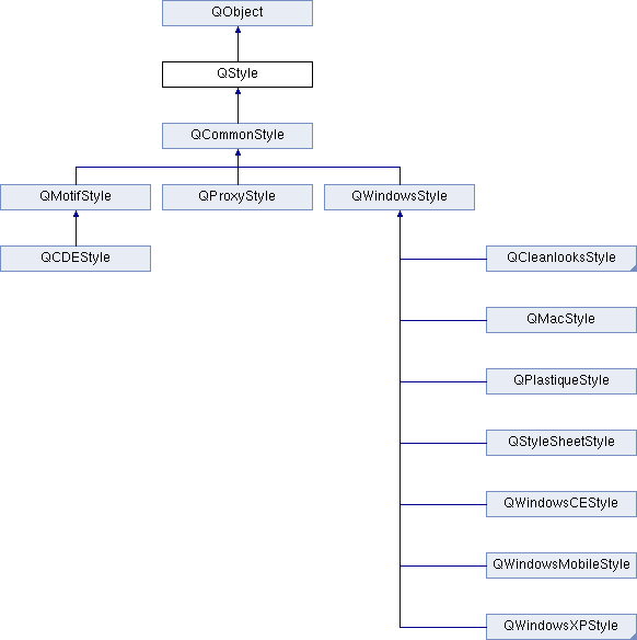
Qt contains a set of QStyle subclasses that emulate the styles of the different platforms supported by Qt (QWindowsStyle, QMacStyle, QMotifStyle, etc.). By default, these styles are built into the QtGui library. Styles can also be made available as plugins.

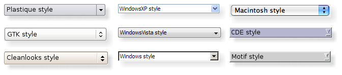
Qt's built-in widgets use QStyle to perform nearly all of their drawing, ensuring that they look exactly like the equivalent native widgets. The diagram below shows a QComboBox in eight different styles.

qstyle-comboboxes.png
Eight combo boxes

Topics:

Setting a Style

The style of the entire application can be set using the QApplication::setStyle() function. It can also be specified by the user of the application, using the -style command-line option:

./myapplication -style motif

If no style is specified, Qt will choose the most appropriate style for the user's platform or desktop environment.

A style can also be set on an individual widget using the QWidget::setStyle() function.

Developing Style-Aware Custom Widgets

If you are developing custom widgets and want them to look good on all platforms, you can use QStyle functions to perform parts of the widget drawing, such as drawItemText(), drawItemPixmap(), drawPrimitive(), drawControl(), and drawComplexControl().

Most QStyle draw functions take four arguments:

For example, if you want to draw a focus rectangle on your widget, you can write:

void MyWidget::paintEvent(QPaintEvent * /* event */)
{
QPainter painter(this);
option.initFrom(this);
option.backgroundColor = palette().color(QPalette::Background);
style()->drawPrimitive(QStyle::PE_FrameFocusRect, &option, &painter, this);
}

QStyle gets all the information it needs to render the graphical element from QStyleOption. The widget is passed as the last argument in case the style needs it to perform special effects (such as animated default buttons on Mac OS X), but it isn't mandatory. In fact, you can use QStyle to draw on any paint device, not just widgets, by setting the QPainter properly.

QStyleOption has various subclasses for the various types of graphical elements that can be drawn. For example, PE_FrameFocusRect expects a QStyleOptionFocusRect argument.

To ensure that drawing operations are as fast as possible, QStyleOption and its subclasses have public data members. See the QStyleOption class documentation for details on how to use it.

For convenience, Qt provides the QStylePainter class, which combines a QStyle, a QPainter, and a QWidget. This makes it possible to write

QStylePainter painter(this);

...

painter.drawPrimitive(QStyle::PE_FrameFocusRect, option);

instead of

QPainter painter(this);

...

style()->drawPrimitive(QStyle::PE_FrameFocusRect, &option, &painter, this);

Creating a Custom Style

You can create a custom look and feel for your application by creating a custom style. There are two approaches to creating a custom style. In the static approach, you either choose an existing QStyle class, subclass it, and reimplement virtual functions to provide the custom behavior, or you create an entire QStyle class from scratch. In the dynamic approach, you modify the behavior of your system style at runtime. The static approach is described below. The dynamic approach is described in QProxyStyle.

The first step in the static approach is to pick one of the styles provided by Qt from which you will build your custom style. Your choice of QStyle class will depend on which style resembles your desired style the most. The most general class that you can use as a base is QCommonStyle (not QStyle). This is because Qt requires its styles to be QCommonStyle.

Depending on which parts of the base style you want to change, you must reimplement the functions that are used to draw those parts of the interface. To illustrate this, we will modify the look of the spin box arrows drawn by QWindowsStyle. The arrows are primitive elements that are drawn by the drawPrimitive() function, so we need to reimplement that function. We need the following class declaration:

class CustomStyle : public QWindowsStyle
{
public:
CustomStyle()
~CustomStyle() {}
void drawPrimitive(PrimitiveElement element, const QStyleOption *option,
QPainter *painter, const QWidget *widget) const;
};

To draw its up and down arrows, QSpinBox uses the PE_IndicatorSpinUp and PE_IndicatorSpinDown primitive elements. Here's how to reimplement the drawPrimitive() function to draw them differently:

void CustomStyle::drawPrimitive(PrimitiveElement element, const QStyleOption *option,
QPainter *painter, const QWidget *widget) const
{
if (element == PE_IndicatorSpinUp || element == PE_IndicatorSpinDown) {
QPolygon points(3);
int x = option->rect.x();
int y = option->rect.y();
int w = option->rect.width() / 2;
int h = option->rect.height() / 2;
x += (option->rect.width() - w) / 2;
y += (option->rect.height() - h) / 2;
if (element == PE_IndicatorSpinUp) {
points[0] = QPoint(x, y + h);
points[1] = QPoint(x + w, y + h);
}
}

Notice that we don't use the widget argument, except to pass it on to the QWindowStyle::drawPrimitive() function. As mentioned earlier, the information about what is to be drawn and how it should be drawn is specified by a QStyleOption object, so there is no need to ask the widget.

If you need to use the widget argument to obtain additional information, be careful to ensure that it isn't 0 and that it is of the correct type before using it. For example:

if (spinBox) {

...

}

When implementing a custom style, you cannot assume that the widget is a QSpinBox just because the enum value is called PE_IndicatorSpinUp or PE_IndicatorSpinDown.

The documentation for the Styles example covers this topic in more detail.

Warning
Qt style sheets are currently not supported for custom QStyle subclasses. We plan to address this in some future release.

Using a Custom Style

There are several ways of using a custom style in a Qt application. The simplest way is to pass the custom style to the QApplication::setStyle() static function before creating the QApplication object:

#include <QtGui>
#include "customstyle.h"
int main(int argc, char *argv[])
{
QApplication::setStyle(new CustomStyle);
QApplication app(argc, argv);
QSpinBox spinBox;
spinBox.show();
return app.exec();
}

You can call QApplication::setStyle() at any time, but by calling it before the constructor, you ensure that the user's preference, set using the -style command-line option, is respected.

You may want to make your custom style available for use in other applications, which may not be yours and hence not available for you to recompile. The Qt Plugin system makes it possible to create styles as plugins. Styles created as plugins are loaded as shared objects at runtime by Qt itself. Please refer to the Qt Plugin documentation for more information on how to go about creating a style plugin.

Compile your plugin and put it into Qt's plugins/styles directory. We now have a pluggable style that Qt can load automatically. To use your new style with existing applications, simply start the application with the following argument:

./myapplication -style custom

The application will use the look and feel from the custom style you implemented.

Right-to-Left Desktops

Languages written from right to left (such as Arabic and Hebrew) usually also mirror the whole layout of widgets, and require the light to come from the screen's top-right corner instead of top-left.

If you create a custom style, you should take special care when drawing asymmetric elements to make sure that they also look correct in a mirrored layout. An easy way to test your styles is to run applications with the -reverse command-line option or to call QApplication::setLayoutDirection() in your main() function.

Here are some things to keep in mind when making a style work well in a right-to-left environment:

Styles in Item Views

The painting of items in views is performed by a delegate. Qt's default delegate, QStyledItemDelegate, is also used for calculating bounding rectangles of items, and their sub-elements for the various kind of item data roles QStyledItemDelegate supports. See the QStyledItemDelegate class description to find out which datatypes and roles are supported. You can read more about item data roles in Model/View Programming.

When QStyledItemDelegate paints its items, it draws CE_ItemViewItem, and calculates their size with CT_ItemViewItem. Note also that it uses SE_ItemViewItemText to set the size of editors. When implementing a style to customize drawing of item views, you need to check the implementation of QCommonStyle (and any other subclasses from which your style inherits). This way, you find out which and how other style elements are painted, and you can then reimplement the painting of elements that should be drawn differently.

We include a small example where we customize the drawing of item backgrounds.

switch (element) {
painter->save();
QPoint topLeft = option->rect.topLeft();
QPoint bottomRight = option->rect.topRight();
QLinearGradient backgroundGradient(topLeft, bottomRight);
backgroundGradient.setColorAt(0.0, QColor(Qt::yellow).lighter(190));
backgroundGradient.setColorAt(1.0, Qt::white);
painter->fillRect(option->rect, QBrush(backgroundGradient));
painter->restore();
break;
}
default:
QWindowsStyle::drawPrimitive(element, option, painter, widget);
}

The primitive element PE_PanelItemViewItem is responsible for painting the background of items, and is called from QCommonStyle's implementation of CE_ItemViewItem.

To add support for drawing of new datatypes and item data roles, it is necessary to create a custom delegate. But if you only need to support the datatypes implemented by the default delegate, a custom style does not need an accompanying delegate. The QStyledItemDelegate class description gives more information on custom delegates.

The drawing of item view headers is also done by the style, giving control over size of header items and row and column sizes.

See also
QStyleOption, QStylePainter, {Styles Example}, {Styles and Style Aware Widgets}, QStyledItemDelegate

Definition at line 68 of file qstyle.h.

Enumerations

◆ ComplexControl

This enum describes the available complex controls.

Complex controls have different behavior depending upon where the user clicks on them or which keys are pressed.

  • CC_SpinBox A spinbox, like QSpinBox.
  • CC_ComboBox A combobox, like QComboBox.
  • CC_ScrollBar A scroll bar, like QScrollBar.
  • CC_Slider A slider, like QSlider.
  • CC_ToolButton A tool button, like QToolButton.
  • CC_TitleBar A Title bar, like those used in QMdiSubWindow.
  • CC_Q3ListView Used for drawing the Q3ListView class.
  • CC_GroupBox A group box, like QGroupBox.
  • CC_Dial A dial, like QDial.
  • CC_MdiControls The minimize, close, and normal button in the menu bar for a maximized MDI subwindow.
  • CC_CustomBase Base value for custom complex controls. Custom values must be greater than this value.
See also
SubControl drawComplexControl()
Enumerator
CC_SpinBox 
CC_ComboBox 
CC_ScrollBar 
CC_Slider 
CC_ToolButton 
CC_TitleBar 
CC_Q3ListView 
CC_Dial 
CC_GroupBox 
CC_MdiControls 
CC_CustomBase 

Definition at line 386 of file qstyle.h.

386  {
387  CC_SpinBox,
388  CC_ComboBox,
389  CC_ScrollBar,
390  CC_Slider,
392  CC_TitleBar,
394  CC_Dial,
395  CC_GroupBox,
397 
398  // do not add any values below/greater than this
399  CC_CustomBase = 0xf0000000
400  };

◆ ContentsType

This enum describes the available contents types.

These are used to calculate sizes for the contents of various widgets.

  • CT_CheckBox A check box, like QCheckBox.
  • CT_ComboBox A combo box, like QComboBox.
  • CT_DialogButtons
  • CT_Q3DockWindow A Q3DockWindow.
  • CT_HeaderSection A header section, like QHeader.
  • CT_LineEdit A line edit, like QLineEdit.
  • CT_Menu A menu, like QMenu.
  • CT_Q3Header A Qt 3 header section, like Q3Header.
  • CT_MenuBar A menu bar, like QMenuBar.
  • CT_MenuBarItem A menu bar item, like the buttons in a QMenuBar.
  • CT_MenuItem A menu item, like QMenuItem.
  • CT_ProgressBar A progress bar, like QProgressBar.
  • CT_PushButton A push button, like QPushButton.
  • CT_RadioButton A radio button, like QRadioButton.
  • CT_SizeGrip A size grip, like QSizeGrip.
  • CT_Slider A slider, like QSlider.
  • CT_ScrollBar A scroll bar, like QScrollBar.
  • CT_SpinBox A spin box, like QSpinBox.
  • CT_Splitter A splitter, like QSplitter.
  • CT_TabBarTab A tab on a tab bar, like QTabBar.
  • CT_TabWidget A tab widget, like QTabWidget.
  • CT_ToolButton A tool button, like QToolButton.
  • CT_GroupBox A group box, like QGroupBox.
  • CT_ItemViewItem An item inside an item view.
  • CT_CustomBase Base value for custom contents types. Custom values must be greater than this value.
  • CT_MdiControls The minimize, normal, and close button in the menu bar for a maximized MDI subwindow.
See also
sizeFromContents()
Enumerator
CT_PushButton 
CT_CheckBox 
CT_RadioButton 
CT_ToolButton 
CT_ComboBox 
CT_Splitter 
CT_Q3DockWindow 
CT_ProgressBar 
CT_MenuItem 
CT_MenuBarItem 
CT_MenuBar 
CT_Menu 
CT_TabBarTab 
CT_Slider 
CT_ScrollBar 
CT_Q3Header 
CT_LineEdit 
CT_SpinBox 
CT_SizeGrip 
CT_TabWidget 
CT_DialogButtons 
CT_HeaderSection 
CT_GroupBox 
CT_MdiControls 
CT_ItemViewItem 
CT_CustomBase 

Definition at line 602 of file qstyle.h.

602  {
604  CT_CheckBox,
607  CT_ComboBox,
608  CT_Splitter,
611  CT_MenuItem,
613  CT_MenuBar,
614  CT_Menu,
615  CT_TabBarTab,
616  CT_Slider,
617  CT_ScrollBar,
618  CT_Q3Header,
619  CT_LineEdit,
620  CT_SpinBox,
621  CT_SizeGrip,
622  CT_TabWidget,
625  CT_GroupBox,
628  // do not add any values below/greater than this
629  CT_CustomBase = 0xf0000000
630  };

◆ ControlElement

This enum represents a control element.

A control element is a part of a widget that performs some action or displays information to the user.

  • CE_PushButton A QPushButton, draws CE_PushButtonBevel, CE_PushButtonLabel and PE_FrameFocusRect.
  • CE_PushButtonBevel The bevel and default indicator of a QPushButton.
  • CE_PushButtonLabel The label (an icon with text or pixmap) of a QPushButton.
  • CE_DockWidgetTitle Dock window title.
  • CE_Splitter Splitter handle; see also QSplitter.
  • CE_CheckBox A QCheckBox, draws a PE_IndicatorCheckBox, a CE_CheckBoxLabel and a PE_FrameFocusRect.
  • CE_CheckBoxLabel The label (text or pixmap) of a QCheckBox.
  • CE_RadioButton A QRadioButton, draws a PE_IndicatorRadioButton, a CE_RadioButtonLabel and a PE_FrameFocusRect.
  • CE_RadioButtonLabel The label (text or pixmap) of a QRadioButton.
  • CE_TabBarTab The tab and label within a QTabBar.
  • CE_TabBarTabShape The tab shape within a tab bar.
  • CE_TabBarTabLabel The label within a tab.
  • CE_ProgressBar A QProgressBar, draws CE_ProgressBarGroove, CE_ProgressBarContents and CE_ProgressBarLabel.
  • CE_ProgressBarGroove The groove where the progress indicator is drawn in a QProgressBar.
  • CE_ProgressBarContents The progress indicator of a QProgressBar.
  • CE_ProgressBarLabel The text label of a QProgressBar.
  • CE_ToolButtonLabel A tool button's label.
  • CE_MenuBarItem A menu item in a QMenuBar.
  • CE_MenuBarEmptyArea The empty area of a QMenuBar.
  • CE_MenuItem A menu item in a QMenu.
  • CE_MenuScroller Scrolling areas in a QMenu when the style supports scrolling.
  • CE_MenuTearoff A menu item representing the tear off section of a QMenu.
  • CE_MenuEmptyArea The area in a menu without menu items.
  • CE_MenuHMargin The horizontal extra space on the left/right of a menu.
  • CE_MenuVMargin The vertical extra space on the top/bottom of a menu.
  • CE_Q3DockWindowEmptyArea The empty area of a QDockWidget.
  • CE_ToolBoxTab The toolbox's tab and label within a QToolBox.
  • CE_SizeGrip Window resize handle; see also QSizeGrip.
  • CE_Header A header.
  • CE_HeaderSection A header section.
  • CE_HeaderLabel The header's label.
  • CE_ScrollBarAddLine Scroll bar line increase indicator. (i.e., scroll down); see also QScrollBar.
  • CE_ScrollBarSubLine Scroll bar line decrease indicator (i.e., scroll up).
  • CE_ScrollBarAddPage Scolllbar page increase indicator (i.e., page down).
  • CE_ScrollBarSubPage Scroll bar page decrease indicator (i.e., page up).
  • CE_ScrollBarSlider Scroll bar slider.
  • CE_ScrollBarFirst Scroll bar first line indicator (i.e., home).
  • CE_ScrollBarLast Scroll bar last line indicator (i.e., end).
  • CE_RubberBand Rubber band used in for example an icon view.
  • CE_FocusFrame Focus frame that is style controlled.
  • CE_ItemViewItem An item inside an item view.
  • CE_CustomBase Base value for custom control elements; custom values must be greater than this value.
  • CE_ComboBoxLabel The label of a non-editable QComboBox.
  • CE_ToolBar A toolbar like QToolBar.
  • CE_ToolBoxTabShape The toolbox's tab shape.
  • CE_ToolBoxTabLabel The toolbox's tab label.
  • CE_HeaderEmptyArea The area of a header view where there are no header sections.
  • CE_ColumnViewGrip
See also
drawControl()
Enumerator
CE_PushButton 
CE_PushButtonBevel 
CE_PushButtonLabel 
CE_CheckBox 
CE_CheckBoxLabel 
CE_RadioButton 
CE_RadioButtonLabel 
CE_TabBarTab 
CE_TabBarTabShape 
CE_TabBarTabLabel 
CE_ProgressBar 
CE_ProgressBarGroove 
CE_ProgressBarContents 
CE_ProgressBarLabel 
CE_MenuItem 
CE_MenuScroller 
CE_MenuVMargin 
CE_MenuHMargin 
CE_MenuTearoff 
CE_MenuEmptyArea 
CE_MenuBarItem 
CE_MenuBarEmptyArea 
CE_ToolButtonLabel 
CE_Header 
CE_HeaderSection 
CE_HeaderLabel 
CE_Q3DockWindowEmptyArea 
CE_ToolBoxTab 
CE_SizeGrip 
CE_Splitter 
CE_RubberBand 
CE_DockWidgetTitle 
CE_ScrollBarAddLine 
CE_ScrollBarSubLine 
CE_ScrollBarAddPage 
CE_ScrollBarSubPage 
CE_ScrollBarSlider 
CE_ScrollBarFirst 
CE_ScrollBarLast 
CE_FocusFrame 
CE_ComboBoxLabel 
CE_ToolBar 
CE_ToolBoxTabShape 
CE_ToolBoxTabLabel 
CE_HeaderEmptyArea 
CE_ColumnViewGrip 
CE_ItemViewItem 
CE_ShapedFrame 
CE_CustomBase 

Definition at line 217 of file qstyle.h.

217  {
221 
222  CE_CheckBox,
224 
227 
228  CE_TabBarTab,
231 
236 
237  CE_MenuItem,
243 
246 
248 
249  CE_Header,
252 
255  CE_SizeGrip,
256  CE_Splitter,
259 
267 
270 
271  CE_ToolBar,
275 
277 
279 
281 
282  // do not add any values below/greater than this
283  CE_CustomBase = 0xf0000000
284  };

◆ PixelMetric

This enum describes the various available pixel metrics.

A pixel metric is a style dependent size represented by a single pixel value.

  • PM_ButtonMargin Amount of whitespace between push button labels and the frame.
  • PM_DockWidgetTitleBarButtonMargin Amount of whitespace between dock widget's title bar button labels and the frame.
  • PM_ButtonDefaultIndicator Width of the default-button indicator frame.
  • PM_MenuButtonIndicator Width of the menu button indicator proportional to the widget height.
  • PM_ButtonShiftHorizontal Horizontal contents shift of a button when the button is down.
  • PM_ButtonShiftVertical Vertical contents shift of a button when the button is down.
  • PM_DefaultFrameWidth Default frame width (usually 2).
  • PM_SpinBoxFrameWidth Frame width of a spin box, defaults to PM_DefaultFrameWidth.
  • PM_ComboBoxFrameWidth Frame width of a combo box, defaults to PM_DefaultFrameWidth.
  • PM_MDIFrameWidth Obsolete. Use PM_MdiSubWindowFrameWidth instead.
  • PM_MdiSubWindowFrameWidth Frame width of an MDI window.
  • PM_MDIMinimizedWidth Obsolete. Use PM_MdiSubWindowMinimizedWidth instead.
  • PM_MdiSubWindowMinimizedWidth Width of a minimized MDI window.
  • PM_MaximumDragDistance The maximum allowed distance between the mouse and a scrollbar when dragging. Exceeding the specified distance will cause the slider to jump back to the original position; a value of -1 disables this behavior.
  • PM_ScrollBarExtent Width of a vertical scroll bar and the height of a horizontal scroll bar.
  • PM_ScrollBarSliderMin The minimum height of a vertical scroll bar's slider and the minimum width of a horizontal scroll bar's slider.
  • PM_SliderThickness Total slider thickness.
  • PM_SliderControlThickness Thickness of the slider handle.
  • PM_SliderLength Length of the slider.
  • PM_SliderTickmarkOffset The offset between the tickmarks and the slider.
  • PM_SliderSpaceAvailable The available space for the slider to move.
  • PM_DockWidgetSeparatorExtent Width of a separator in a horizontal dock window and the height of a separator in a vertical dock window.
  • PM_DockWidgetHandleExtent Width of the handle in a horizontal dock window and the height of the handle in a vertical dock window.
  • PM_DockWidgetFrameWidth Frame width of a dock window.
  • PM_DockWidgetTitleMargin Margin of the dock window title.
  • PM_MenuBarPanelWidth Frame width of a menu bar, defaults to PM_DefaultFrameWidth.
  • PM_MenuBarItemSpacing Spacing between menu bar items.
  • PM_MenuBarHMargin Spacing between menu bar items and left/right of bar.
  • PM_MenuBarVMargin Spacing between menu bar items and top/bottom of bar.
  • PM_ToolBarFrameWidth Width of the frame around toolbars.
  • PM_ToolBarHandleExtent Width of a toolbar handle in a horizontal toolbar and the height of the handle in a vertical toolbar.
  • PM_ToolBarItemMargin Spacing between the toolbar frame and the items.
  • PM_ToolBarItemSpacing Spacing between toolbar items.
  • PM_ToolBarSeparatorExtent Width of a toolbar separator in a horizontal toolbar and the height of a separator in a vertical toolbar.
  • PM_ToolBarExtensionExtent Width of a toolbar extension button in a horizontal toolbar and the height of the button in a vertical toolbar.
  • PM_TabBarTabOverlap Number of pixels the tabs should overlap. (Currently only used in styles, not inside of QTabBar)
  • PM_TabBarTabHSpace Extra space added to the tab width.
  • PM_TabBarTabVSpace Extra space added to the tab height.
  • PM_TabBarBaseHeight Height of the area between the tab bar and the tab pages.
  • PM_TabBarBaseOverlap Number of pixels the tab bar overlaps the tab bar base.
  • PM_TabBarScrollButtonWidth
  • PM_TabBarTabShiftHorizontal Horizontal pixel shift when a tab is selected.
  • PM_TabBarTabShiftVertical Vertical pixel shift when a tab is selected.
  • PM_ProgressBarChunkWidth Width of a chunk in a progress bar indicator.
  • PM_SplitterWidth Width of a splitter.
  • PM_TitleBarHeight Height of the title bar.
  • PM_IndicatorWidth Width of a check box indicator.
  • PM_IndicatorHeight Height of a checkbox indicator.
  • PM_ExclusiveIndicatorWidth Width of a radio button indicator.
  • PM_ExclusiveIndicatorHeight Height of a radio button indicator.
  • PM_MenuPanelWidth Border width (applied on all sides) for a QMenu.
  • PM_MenuHMargin Additional border (used on left and right) for a QMenu.
  • PM_MenuVMargin Additional border (used for bottom and top) for a QMenu.
  • PM_MenuScrollerHeight Height of the scroller area in a QMenu.
  • PM_MenuTearoffHeight Height of a tear off area in a QMenu.
  • PM_MenuDesktopFrameWidth The frame width for the menu on the desktop.
  • PM_CheckListButtonSize Area (width/height) of the checkbox/radio button in a Q3CheckListItem.
  • PM_CheckListControllerSize Area (width/height) of the controller in a Q3CheckListItem.
  • PM_DialogButtonsSeparator
  • PM_DialogButtonsButtonWidth
  • PM_DialogButtonsButtonHeight
  • PM_HeaderMarkSize The size of the sort indicator in a header.
  • PM_HeaderGripMargin The size of the resize grip in a header.
  • PM_HeaderMargin The size of the margin between the sort indicator and the text.
  • PM_SpinBoxSliderHeight The height of the optional spin box slider.
  • PM_ToolBarIconSize Default tool bar icon size
  • PM_SmallIconSize Default small icon size
  • PM_LargeIconSize Default large icon size
  • PM_FocusFrameHMargin Horizontal margin that the focus frame will outset the widget by.
  • PM_FocusFrameVMargin Vertical margin that the focus frame will outset the widget by.
  • PM_IconViewIconSize The default size for icons in an icon view.
  • PM_ListViewIconSize The default size for icons in a list view.
  • PM_ToolTipLabelFrameWidth The frame width for a tool tip label.
  • PM_CheckBoxLabelSpacing The spacing between a check box indicator and its label.
  • PM_RadioButtonLabelSpacing The spacing between a radio button indicator and its label.
  • PM_TabBarIconSize The default icon size for a tab bar.
  • PM_SizeGripSize The size of a size grip.
  • PM_MessageBoxIconSize The size of the standard icons in a message box
  • PM_ButtonIconSize The default size of button icons
  • PM_TextCursorWidth The width of the cursor in a line edit or text edit
  • PM_TabBar_ScrollButtonOverlap The distance between the left and right buttons in a tab bar.
  • PM_TabCloseIndicatorWidth The default width of a close button on a tab in a tab bar.
  • PM_TabCloseIndicatorHeight The default height of a close button on a tab in a tab bar.
  • PM_CustomBase Base value for custom pixel metrics. Custom values must be greater than this value.

The following values are obsolete:

  • PM_DefaultTopLevelMargin Use PM_LayoutLeftMargin, PM_LayoutTopMargin, PM_LayoutRightMargin, and PM_LayoutBottomMargin instead.
  • PM_DefaultChildMargin Use PM_LayoutLeftMargin, PM_LayoutTopMargin, PM_LayoutRightMargin, and PM_LayoutBottomMargin instead.
  • PM_DefaultLayoutSpacing Use PM_LayoutHorizontalSpacing and PM_LayoutVerticalSpacing instead.
  • PM_ScrollView_ScrollBarSpacing Distance between frame and scrollbar with SH_ScrollView_FrameOnlyAroundContents set.
  • PM_SubMenuOverlap The horizontal overlap between a submenu and its parent.
See also
pixelMetric()
Enumerator
PM_ButtonMargin 
PM_ButtonDefaultIndicator 
PM_MenuButtonIndicator 
PM_ButtonShiftHorizontal 
PM_ButtonShiftVertical 
PM_DefaultFrameWidth 
PM_SpinBoxFrameWidth 
PM_ComboBoxFrameWidth 
PM_MaximumDragDistance 
PM_ScrollBarExtent 
PM_ScrollBarSliderMin 
PM_SliderThickness 
PM_SliderControlThickness 
PM_SliderLength 
PM_SliderTickmarkOffset 
PM_SliderSpaceAvailable 
PM_DockWidgetSeparatorExtent 
PM_DockWidgetHandleExtent 
PM_DockWidgetFrameWidth 
PM_TabBarTabOverlap 
PM_TabBarTabHSpace 
PM_TabBarTabVSpace 
PM_TabBarBaseHeight 
PM_TabBarBaseOverlap 
PM_ProgressBarChunkWidth 
PM_SplitterWidth 
PM_TitleBarHeight 
PM_MenuScrollerHeight 
PM_MenuHMargin 
PM_MenuVMargin 
PM_MenuPanelWidth 
PM_MenuTearoffHeight 
PM_MenuDesktopFrameWidth 
PM_MenuBarPanelWidth 
PM_MenuBarItemSpacing 
PM_MenuBarVMargin 
PM_MenuBarHMargin 
PM_IndicatorWidth 
PM_IndicatorHeight 
PM_ExclusiveIndicatorWidth 
PM_ExclusiveIndicatorHeight 
PM_CheckListButtonSize 
PM_CheckListControllerSize 
PM_DialogButtonsSeparator 
PM_DialogButtonsButtonWidth 
PM_DialogButtonsButtonHeight 
PM_MdiSubWindowFrameWidth 
PM_MDIFrameWidth 
PM_MdiSubWindowMinimizedWidth 
PM_MDIMinimizedWidth 
PM_HeaderMargin 
PM_HeaderMarkSize 
PM_HeaderGripMargin 
PM_TabBarTabShiftHorizontal 
PM_TabBarTabShiftVertical 
PM_TabBarScrollButtonWidth 
PM_ToolBarFrameWidth 
PM_ToolBarHandleExtent 
PM_ToolBarItemSpacing 
PM_ToolBarItemMargin 
PM_ToolBarSeparatorExtent 
PM_ToolBarExtensionExtent 
PM_SpinBoxSliderHeight 
PM_DefaultTopLevelMargin 
PM_DefaultChildMargin 
PM_DefaultLayoutSpacing 
PM_ToolBarIconSize 
PM_ListViewIconSize 
PM_IconViewIconSize 
PM_SmallIconSize 
PM_LargeIconSize 
PM_FocusFrameVMargin 
PM_FocusFrameHMargin 
PM_ToolTipLabelFrameWidth 
PM_CheckBoxLabelSpacing 
PM_TabBarIconSize 
PM_SizeGripSize 
PM_DockWidgetTitleMargin 
PM_MessageBoxIconSize 
PM_ButtonIconSize 
PM_DockWidgetTitleBarButtonMargin 
PM_RadioButtonLabelSpacing 
PM_LayoutLeftMargin 
PM_LayoutTopMargin 
PM_LayoutRightMargin 
PM_LayoutBottomMargin 
PM_LayoutHorizontalSpacing 
PM_LayoutVerticalSpacing 
PM_TabBar_ScrollButtonOverlap 
PM_TextCursorWidth 
PM_TabCloseIndicatorWidth 
PM_TabCloseIndicatorHeight 
PM_ScrollView_ScrollBarSpacing 
PM_SubMenuOverlap 
PM_CustomBase 

Definition at line 474 of file qstyle.h.

474  {
480 
484 
486 
489 
490  PM_SliderThickness, // total slider thickness
491  PM_SliderControlThickness, // thickness of the business part
492  PM_SliderLength, // total length of slider
494  PM_SliderSpaceAvailable, // available space for slider to move
495 
499 
505 
507 
510 
517 
522 
529 
533 
538 
545 
552 
554 
558 
564 
567 
575 
577 
586 
588 
591 
594 
595  // do not add any values below/greater than this
596  PM_CustomBase = 0xf0000000
597  };

◆ PrimitiveElement

This enum describes the various primitive elements.

A primitive element is a common GUI element, such as a checkbox indicator or button bevel.

  • PE_IndicatorViewItemCheck
  • PE_FrameStatusBar Frame
  • PE_PanelButtonCommand Button used to initiate an action, for example, a QPushButton.
  • PE_FrameDefaultButton This frame around a default button, e.g. in a dialog.
  • PE_PanelButtonBevel Generic panel with a button bevel.
  • PE_PanelButtonTool Panel for a Tool button, used with QToolButton.
  • PE_PanelLineEdit Panel for a QLineEdit.
  • PE_IndicatorButtonDropDown Indicator for a drop down button, for example, a tool button that displays a menu.
  • PE_FrameFocusRect Generic focus indicator.
  • PE_IndicatorArrowUp Generic Up arrow.
  • PE_IndicatorArrowDown Generic Down arrow.
  • PE_IndicatorArrowRight Generic Right arrow.
  • PE_IndicatorArrowLeft Generic Left arrow.
  • PE_IndicatorSpinUp Up symbol for a spin widget, for example a QSpinBox.
  • PE_IndicatorSpinDown Down symbol for a spin widget.
  • PE_IndicatorSpinPlus Increase symbol for a spin widget.
  • PE_IndicatorSpinMinus Decrease symbol for a spin widget.
  • PE_IndicatorItemViewItemCheck On/off indicator for a view item.
  • PE_IndicatorCheckBox On/off indicator, for example, a QCheckBox.
  • PE_IndicatorRadioButton Exclusive on/off indicator, for example, a QRadioButton.
  • PE_Q3DockWindowSeparator Item separator for Qt 3 compatible dock window and toolbar contents.
  • PE_IndicatorDockWidgetResizeHandle Resize handle for dock windows.
  • PE_Frame Generic frame
  • PE_FrameMenu Frame for popup windows/menus; see also QMenu.
  • PE_PanelMenuBar Panel for menu bars.
  • PE_PanelScrollAreaCorner Panel at the bottom-right (or bottom-left) corner of a scroll area.
  • PE_FrameDockWidget Panel frame for dock windows and toolbars.
  • PE_FrameTabWidget Frame for tab widgets.
  • PE_FrameLineEdit Panel frame for line edits.
  • PE_FrameGroupBox Panel frame around group boxes.
  • PE_FrameButtonBevel Panel frame for a button bevel.
  • PE_FrameButtonTool Panel frame for a tool button.
  • PE_IndicatorHeaderArrow Arrow used to indicate sorting on a list or table header.
  • PE_FrameStatusBarItem Frame for an item of a status bar; see also QStatusBar.
  • PE_FrameWindow Frame around a MDI window or a docking window.
  • PE_Q3Separator Qt 3 compatible generic separator.
  • PE_IndicatorMenuCheckMark Check mark used in a menu.
  • PE_IndicatorProgressChunk Section of a progress bar indicator; see also QProgressBar.
  • PE_Q3CheckListController Qt 3 compatible controller part of a list view item.
  • PE_Q3CheckListIndicator Qt 3 compatible checkbox part of a list view item.
  • PE_Q3CheckListExclusiveIndicator Qt 3 compatible radio button part of a list view item.
  • PE_IndicatorBranch Lines used to represent the branch of a tree in a tree view.
  • PE_IndicatorToolBarHandle The handle of a toolbar.
  • PE_IndicatorToolBarSeparator The separator in a toolbar.
  • PE_PanelToolBar The panel for a toolbar.
  • PE_PanelTipLabel The panel for a tip label.
  • PE_FrameTabBarBase The frame that is drawn for a tab bar, ususally drawn for a tab bar that isn't part of a tab widget.
  • PE_IndicatorTabTear An indicator that a tab is partially scrolled out of the visible tab bar when there are many tabs.
  • PE_IndicatorColumnViewArrow An arrow in a QColumnView.
  • PE_CustomBase Base value for custom primitive elements. All values above this are reserved for custom use. Custom values must be greater than this value.
  • PE_IndicatorItemViewItemDrop An indicator that is drawn to show where an item in an item view is about to be dropped during a drag-and-drop operation in an item view.
  • PE_PanelItemViewItem The background for an item in an item view.
  • PE_PanelItemViewRow The background of a row in an item view.
  • PE_PanelStatusBar The panel for a status bar.
  • PE_IndicatorTabClose The close button on a tab bar.
  • PE_PanelMenu The panel for a menu.
See also
drawPrimitive()
Enumerator
PE_Q3CheckListController 
PE_Q3CheckListExclusiveIndicator 
PE_Q3CheckListIndicator 
PE_Q3DockWindowSeparator 
PE_Q3Separator 
PE_Frame 
PE_FrameDefaultButton 
PE_FrameDockWidget 
PE_FrameFocusRect 
PE_FrameGroupBox 
PE_FrameLineEdit 
PE_FrameMenu 
PE_FrameStatusBar 
PE_FrameStatusBarItem 
PE_FrameTabWidget 
PE_FrameWindow 
PE_FrameButtonBevel 
PE_FrameButtonTool 
PE_FrameTabBarBase 
PE_PanelButtonCommand 
PE_PanelButtonBevel 
PE_PanelButtonTool 
PE_PanelMenuBar 
PE_PanelToolBar 
PE_PanelLineEdit 
PE_IndicatorArrowDown 
PE_IndicatorArrowLeft 
PE_IndicatorArrowRight 
PE_IndicatorArrowUp 
PE_IndicatorBranch 
PE_IndicatorButtonDropDown 
PE_IndicatorViewItemCheck 
PE_IndicatorItemViewItemCheck 
PE_IndicatorCheckBox 
PE_IndicatorDockWidgetResizeHandle 
PE_IndicatorHeaderArrow 
PE_IndicatorMenuCheckMark 
PE_IndicatorProgressChunk 
PE_IndicatorRadioButton 
PE_IndicatorSpinDown 
PE_IndicatorSpinMinus 
PE_IndicatorSpinPlus 
PE_IndicatorSpinUp 
PE_IndicatorToolBarHandle 
PE_IndicatorToolBarSeparator 
PE_PanelTipLabel 
PE_IndicatorTabTear 
PE_PanelScrollAreaCorner 
PE_Widget 
PE_IndicatorColumnViewArrow 
PE_IndicatorItemViewItemDrop 
PE_PanelItemViewItem 
PE_PanelItemViewRow 
PE_PanelStatusBar 
PE_IndicatorTabClose 
PE_PanelMenu 
PE_CustomBase 

Definition at line 145 of file qstyle.h.

145  {
151 
152  PE_Frame,
158  PE_FrameMenu,
159  PE_FrameStatusBar, // obsolete
166 
173 
197 
198  PE_Widget,
199 
202 
204  PE_PanelItemViewRow, // ### Qt 5: remove
205 
207 
209  PE_PanelMenu,
210 
211  // do not add any values below/greater this
212  PE_CustomBase = 0xf000000
213  };

◆ RequestSoftwareInputPanel

This enum describes under what circumstances a software input panel will be requested by input capable widgets.

  • RSIP_OnMouseClickAndAlreadyFocused Requests an input panel if the user clicks on the widget, but only if it is already focused.
  • RSIP_OnMouseClick Requests an input panel if the user clicks on the widget.
See also
QEvent::RequestSoftwareInputPanel, QInputContext
Enumerator
RSIP_OnMouseClickAndAlreadyFocused 
RSIP_OnMouseClick 

Definition at line 635 of file qstyle.h.

◆ StandardPixmap

This enum describes the available standard pixmaps.

A standard pixmap is a pixmap that can follow some existing GUI style or guideline.

  • SP_TitleBarMinButton Minimize button on title bars (e.g., in QMdiSubWindow).
  • SP_TitleBarMenuButton Menu button on a title bar.
  • SP_TitleBarMaxButton Maximize button on title bars.
  • SP_TitleBarCloseButton Close button on title bars.
  • SP_TitleBarNormalButton Normal (restore) button on title bars.
  • SP_TitleBarShadeButton Shade button on title bars.
  • SP_TitleBarUnshadeButton Unshade button on title bars.
  • SP_TitleBarContextHelpButton The Context help button on title bars.
  • SP_MessageBoxInformation The "information" icon.
  • SP_MessageBoxWarning The "warning" icon.
  • SP_MessageBoxCritical The "critical" icon.
  • SP_MessageBoxQuestion The "question" icon.
  • SP_DesktopIcon The "desktop" icon.
  • SP_TrashIcon The "trash" icon.
  • SP_ComputerIcon The "My computer" icon.
  • SP_DriveFDIcon The floppy icon.
  • SP_DriveHDIcon The harddrive icon.
  • SP_DriveCDIcon The CD icon.
  • SP_DriveDVDIcon The DVD icon.
  • SP_DriveNetIcon The network icon.
  • SP_DirHomeIcon The home directory icon.
  • SP_DirOpenIcon The open directory icon.
  • SP_DirClosedIcon The closed directory icon.
  • SP_DirIcon The directory icon.
  • SP_DirLinkIcon The link to directory icon.
  • SP_FileIcon The file icon.
  • SP_FileLinkIcon The link to file icon.
  • SP_FileDialogStart The "start" icon in a file dialog.
  • SP_FileDialogEnd The "end" icon in a file dialog.
  • SP_FileDialogToParent The "parent directory" icon in a file dialog.
  • SP_FileDialogNewFolder The "create new folder" icon in a file dialog.
  • SP_FileDialogDetailedView The detailed view icon in a file dialog.
  • SP_FileDialogInfoView The file info icon in a file dialog.
  • SP_FileDialogContentsView The contents view icon in a file dialog.
  • SP_FileDialogListView The list view icon in a file dialog.
  • SP_FileDialogBack The back arrow in a file dialog.
  • SP_DockWidgetCloseButton Close button on dock windows (see also QDockWidget).
  • SP_ToolBarHorizontalExtensionButton Extension button for horizontal toolbars.
  • SP_ToolBarVerticalExtensionButton Extension button for vertical toolbars.
  • SP_DialogOkButton Icon for a standard OK button in a QDialogButtonBox.
  • SP_DialogCancelButton Icon for a standard Cancel button in a QDialogButtonBox.
  • SP_DialogHelpButton Icon for a standard Help button in a QDialogButtonBox.
  • SP_DialogOpenButton Icon for a standard Open button in a QDialogButtonBox.
  • SP_DialogSaveButton Icon for a standard Save button in a QDialogButtonBox.
  • SP_DialogCloseButton Icon for a standard Close button in a QDialogButtonBox.
  • SP_DialogApplyButton Icon for a standard Apply button in a QDialogButtonBox.
  • SP_DialogResetButton Icon for a standard Reset button in a QDialogButtonBox.
  • SP_DialogDiscardButton Icon for a standard Discard button in a QDialogButtonBox.
  • SP_DialogYesButton Icon for a standard Yes button in a QDialogButtonBox.
  • SP_DialogNoButton Icon for a standard No button in a QDialogButtonBox.
  • SP_ArrowUp Icon arrow pointing up.
  • SP_ArrowDown Icon arrow pointing down.
  • SP_ArrowLeft Icon arrow pointing left.
  • SP_ArrowRight Icon arrow pointing right.
  • SP_ArrowBack Equivalent to SP_ArrowLeft when the current layout direction is Qt::LeftToRight, otherwise SP_ArrowRight.
  • SP_ArrowForward Equivalent to SP_ArrowRight when the current layout direction is Qt::LeftToRight, otherwise SP_ArrowLeft.
  • SP_CommandLink Icon used to indicate a Vista style command link glyph.
  • SP_VistaShield Icon used to indicate UAC prompts on Windows Vista. This will return a null pixmap or icon on all other platforms.
  • SP_BrowserReload Icon indicating that the current page should be reloaded.
  • SP_BrowserStop Icon indicating that the page loading should stop.
  • SP_MediaPlay Icon indicating that media should begin playback.
  • SP_MediaStop Icon indicating that media should stop playback.
  • SP_MediaPause Icon indicating that media should pause playback.
  • SP_MediaSkipForward Icon indicating that media should skip forward.
  • SP_MediaSkipBackward Icon indicating that media should skip backward.
  • SP_MediaSeekForward Icon indicating that media should seek forward.
  • SP_MediaSeekBackward Icon indicating that media should seek backward.
  • SP_MediaVolume Icon indicating a volume control.
  • SP_MediaVolumeMuted Icon indicating a muted volume control.
  • SP_CustomBase Base value for custom standard pixmaps; custom values must be greater than this value.
See also
standardIcon()
Enumerator
SP_TitleBarMenuButton 
SP_TitleBarMinButton 
SP_TitleBarMaxButton 
SP_TitleBarCloseButton 
SP_TitleBarNormalButton 
SP_TitleBarShadeButton 
SP_TitleBarUnshadeButton 
SP_TitleBarContextHelpButton 
SP_DockWidgetCloseButton 
SP_MessageBoxInformation 
SP_MessageBoxWarning 
SP_MessageBoxCritical 
SP_MessageBoxQuestion 
SP_DesktopIcon 
SP_TrashIcon 
SP_ComputerIcon 
SP_DriveFDIcon 
SP_DriveHDIcon 
SP_DriveCDIcon 
SP_DriveDVDIcon 
SP_DriveNetIcon 
SP_DirOpenIcon 
SP_DirClosedIcon 
SP_DirLinkIcon 
SP_FileIcon 
SP_FileLinkIcon 
SP_ToolBarHorizontalExtensionButton 
SP_ToolBarVerticalExtensionButton 
SP_FileDialogStart 
SP_FileDialogEnd 
SP_FileDialogToParent 
SP_FileDialogNewFolder 
SP_FileDialogDetailedView 
SP_FileDialogInfoView 
SP_FileDialogContentsView 
SP_FileDialogListView 
SP_FileDialogBack 
SP_DirIcon 
SP_DialogOkButton 
SP_DialogCancelButton 
SP_DialogHelpButton 
SP_DialogOpenButton 
SP_DialogSaveButton 
SP_DialogCloseButton 
SP_DialogApplyButton 
SP_DialogResetButton 
SP_DialogDiscardButton 
SP_DialogYesButton 
SP_DialogNoButton 
SP_ArrowUp 
SP_ArrowDown 
SP_ArrowLeft 
SP_ArrowRight 
SP_ArrowBack 
SP_ArrowForward 
SP_DirHomeIcon 
SP_CommandLink 
SP_VistaShield 
SP_BrowserReload 
SP_BrowserStop 
SP_MediaPlay 
SP_MediaStop 
SP_MediaPause 
SP_MediaSkipForward 
SP_MediaSkipBackward 
SP_MediaSeekForward 
SP_MediaSeekBackward 
SP_MediaVolume 
SP_MediaVolumeMuted 
SP_CustomBase 

Definition at line 755 of file qstyle.h.

755  {
770  SP_TrashIcon,
780  SP_FileIcon,
793  SP_DirIcon,
805  SP_ArrowUp,
806  SP_ArrowDown,
807  SP_ArrowLeft,
809  SP_ArrowBack,
816  SP_MediaPlay,
817  SP_MediaStop,
825  // do not add any values below/greater than this
826  SP_CustomBase = 0xf0000000
827  };

◆ StateFlag

This enum describes flags that are used when drawing primitive elements.

Note that not all primitives use all of these flags, and that the flags may mean different things to different items.

  • State_None Indicates that the widget does not have a state.
  • State_Active Indicates that the widget is active.
  • State_AutoRaise Used to indicate if auto-raise appearance should be usd on a tool button.
  • State_Children Used to indicate if an item view branch has children.
  • State_DownArrow Used to indicate if a down arrow should be visible on the widget.
  • State_Editing Used to indicate if an editor is opened on the widget.
  • State_Enabled Used to indicate if the widget is enabled.
  • State_HasEditFocus Used to indicate if the widget currently has edit focus.
  • State_HasFocus Used to indicate if the widget has focus.
  • State_Horizontal Used to indicate if the widget is laid out horizontally, for example. a tool bar.
  • State_KeyboardFocusChange Used to indicate if the focus was changed with the keyboard, e.g., tab, backtab or shortcut.
  • State_MouseOver Used to indicate if the widget is under the mouse.
  • State_NoChange Used to indicate a tri-state checkbox.
  • State_Off Used to indicate if the widget is not checked.
  • State_On Used to indicate if the widget is checked.
  • State_Raised Used to indicate if a button is raised.
  • State_ReadOnly Used to indicate if a widget is read-only.
  • State_Selected Used to indicate if a widget is selected.
  • State_Item Used by item views to indicate if a horizontal branch should be drawn.
  • State_Open Used by item views to indicate if the tree branch is open.
  • State_Sibling Used by item views to indicate if a vertical line needs to be drawn (for siblings).
  • State_Sunken Used to indicate if the widget is sunken or pressed.
  • State_UpArrow Used to indicate if an up arrow should be visible on the widget.
  • State_Mini Used to indicate a mini style Mac widget or button.
  • State_Small Used to indicate a small style Mac widget or button.
  • State_Window
  • State_Bottom
  • State_Default
  • State_FocusAtBorder
  • State_Top
See also
drawPrimitive()
Enumerator
State_None 
State_Enabled 
State_Raised 
State_Sunken 
State_Off 
State_NoChange 
State_On 
State_DownArrow 
State_Horizontal 
State_HasFocus 
State_Top 
State_Bottom 
State_FocusAtBorder 
State_AutoRaise 
State_MouseOver 
State_UpArrow 
State_Selected 
State_Active 
State_Window 
State_Open 
State_Children 
State_Item 
State_Sibling 
State_Editing 
State_KeyboardFocusChange 
State_ReadOnly 
State_Small 
State_Mini 

Definition at line 103 of file qstyle.h.

103  {
104  State_None = 0x00000000,
105 #ifdef QT3_SUPPORT
106  State_Default = State_None,
107 #endif
108  State_Enabled = 0x00000001,
109  State_Raised = 0x00000002,
110  State_Sunken = 0x00000004,
111  State_Off = 0x00000008,
112  State_NoChange = 0x00000010,
113  State_On = 0x00000020,
114  State_DownArrow = 0x00000040,
115  State_Horizontal = 0x00000080,
116  State_HasFocus = 0x00000100,
117  State_Top = 0x00000200,
118  State_Bottom = 0x00000400,
119  State_FocusAtBorder = 0x00000800,
120  State_AutoRaise = 0x00001000,
121  State_MouseOver = 0x00002000,
122  State_UpArrow = 0x00004000,
123  State_Selected = 0x00008000,
124  State_Active = 0x00010000,
125  State_Window = 0x00020000,
126  State_Open = 0x00040000,
127  State_Children = 0x00080000,
128  State_Item = 0x00100000,
129  State_Sibling = 0x00200000,
130  State_Editing = 0x00400000,
131  State_KeyboardFocusChange = 0x00800000,
132 #ifdef QT_KEYPAD_NAVIGATION
133  State_HasEditFocus = 0x01000000,
134 #endif
135  State_ReadOnly = 0x02000000,
136  State_Small = 0x04000000,
137  State_Mini = 0x08000000
138  };

◆ StyleHint

This enum describes the available style hints.

A style hint is a general look and/or feel hint.

  • SH_EtchDisabledText Disabled text is "etched" as it is on Windows.
  • SH_DitherDisabledText Disabled text is dithered as it is on Motif.
  • SH_GUIStyle The GUI style to use.
  • SH_ScrollBar_ContextMenu Whether or not a scroll bar has a context menu.
  • SH_ScrollBar_MiddleClickAbsolutePosition A boolean value. If true, middle clicking on a scroll bar causes the slider to jump to that position. If false, middle clicking is ignored.
  • SH_ScrollBar_LeftClickAbsolutePosition A boolean value. If true, left clicking on a scroll bar causes the slider to jump to that position. If false, left clicking will behave as appropriate for each control.
  • SH_ScrollBar_ScrollWhenPointerLeavesControl A boolean value. If true, when clicking a scroll bar SubControl, holding the mouse button down and moving the pointer outside the SubControl, the scroll bar continues to scroll. If false, the scollbar stops scrolling when the pointer leaves the SubControl.
  • SH_ScrollBar_RollBetweenButtons A boolean value. If true, when clicking a scroll bar button (SC_ScrollBarAddLine or SC_ScrollBarSubLine) and dragging over to the opposite button (rolling) will press the new button and release the old one. When it is false, the original button is released and nothing happens (like a push button).
  • SH_Header_ArrowAlignment The placement of the sorting indicator may appear in list or table headers. Possible values are Qt::Left or Qt::Right.
  • SH_Slider_SnapToValue Sliders snap to values while moving, as they do on Windows.
  • SH_Slider_SloppyKeyEvents Key presses handled in a sloppy manner, i.e., left on a vertical slider subtracts a line.
  • SH_ProgressDialog_CenterCancelButton Center button on progress dialogs, like Motif, otherwise right aligned.
  • SH_PrintDialog_RightAlignButtons Right align buttons in the print dialog, as done on Windows.
  • SH_MainWindow_SpaceBelowMenuBar One or two pixel space between the menu bar and the dockarea, as done on Windows.
  • SH_FontDialog_SelectAssociatedText Select the text in the line edit, or when selecting an item from the listbox, or when the line edit receives focus, as done on Windows.
  • SH_Menu_KeyboardSearch Typing causes a menu to be search for relevant items, otherwise only mnemnonic is considered.
  • SH_Menu_AllowActiveAndDisabled Allows disabled menu items to be active.
  • SH_Menu_SpaceActivatesItem Pressing the space bar activates the item, as done on Motif.
  • SH_Menu_SubMenuPopupDelay The number of milliseconds to wait before opening a submenu (256 on Windows, 96 on Motif).
  • SH_Menu_Scrollable Whether popup menus must support scrolling.
  • SH_Menu_SloppySubMenus Whether popup menus must support the user moving the mouse cursor to a submenu while crossing other items of the menu. This is supported on most modern desktop platforms.
  • SH_ScrollView_FrameOnlyAroundContents Whether scrollviews draw their frame only around contents (like Motif), or around contents, scroll bars and corner widgets (like Windows).
  • SH_MenuBar_AltKeyNavigation Menu bars items are navigable by pressing Alt, followed by using the arrow keys to select the desired item.
  • SH_ComboBox_ListMouseTracking Mouse tracking in combobox drop-down lists.
  • SH_Menu_MouseTracking Mouse tracking in popup menus.
  • SH_MenuBar_MouseTracking Mouse tracking in menu bars.
  • SH_Menu_FillScreenWithScroll Whether scrolling popups should fill the screen as they are scrolled.
  • SH_Menu_SelectionWrap Whether popups should allow the selections to wrap, that is when selection should the next item be the first item.
  • SH_ItemView_ChangeHighlightOnFocus Gray out selected items when losing focus.
  • SH_Widget_ShareActivation Turn on sharing activation with floating modeless dialogs.
  • SH_TabBar_SelectMouseType Which type of mouse event should cause a tab to be selected.
  • SH_Q3ListViewExpand_SelectMouseType Which type of mouse event should cause a list view expansion to be selected.
  • SH_TabBar_PreferNoArrows Whether a tab bar should suggest a size to prevent scoll arrows.
  • SH_ComboBox_Popup Allows popups as a combobox drop-down menu.
  • SH_Workspace_FillSpaceOnMaximize The workspace should maximize the client area.
  • SH_TitleBar_NoBorder The title bar has no border.
  • SH_ScrollBar_StopMouseOverSlider Obsolete. Use SH_Slider_StopMouseOverSlider instead.
  • SH_Slider_StopMouseOverSlider Stops auto-repeat when the slider reaches the mouse position.
  • SH_BlinkCursorWhenTextSelected Whether cursor should blink when text is selected.
  • SH_RichText_FullWidthSelection Whether richtext selections should extend to the full width of the document.
  • SH_GroupBox_TextLabelVerticalAlignment How to vertically align a group box's text label.
  • SH_GroupBox_TextLabelColor How to paint a group box's text label.
  • SH_DialogButtons_DefaultButton Which button gets the default status in a dialog's button widget.
  • SH_ToolBox_SelectedPageTitleBold Boldness of the selected page title in a QToolBox.
  • SH_LineEdit_PasswordCharacter The Unicode character to be used for passwords.
  • SH_Table_GridLineColor The RGB value of the grid for a table.
  • SH_UnderlineShortcut Whether shortcuts are underlined.
  • SH_SpinBox_AnimateButton Animate a click when up or down is pressed in a spin box.
  • SH_SpinBox_KeyPressAutoRepeatRate Auto-repeat interval for spinbox key presses.
  • SH_SpinBox_ClickAutoRepeatRate Auto-repeat interval for spinbox mouse clicks.
  • SH_SpinBox_ClickAutoRepeatThreshold Auto-repeat threshold for spinbox mouse clicks.
  • SH_ToolTipLabel_Opacity An integer indicating the opacity for the tip label, 0 is completely transparent, 255 is completely opaque.
  • SH_DrawMenuBarSeparator Indicates whether or not the menu bar draws separators.
  • SH_TitleBar_ModifyNotification Indicates if the title bar should show a '*' for windows that are modified.
  • SH_Button_FocusPolicy The default focus policy for buttons.
  • SH_CustomBase Base value for custom style hints. Custom values must be greater than this value.
  • SH_MenuBar_DismissOnSecondClick A boolean indicating if a menu in the menu bar should be dismissed when it is clicked on a second time. (Example: Clicking and releasing on the File Menu in a menu bar and then immediately clicking on the File Menu again.)
  • SH_MessageBox_UseBorderForButtonSpacing A boolean indicating what the to use the border of the buttons (computed as half the button height) for the spacing of the button in a message box.
  • SH_MessageBox_CenterButtons A boolean indicating whether the buttons in the message box should be centered or not (see QDialogButtonBox::setCentered()).
  • SH_MessageBox_TextInteractionFlags A boolean indicating if the text in a message box should allow user interfactions (e.g. selection) or not.
  • SH_TitleBar_AutoRaise A boolean indicating whether controls on a title bar ought to update when the mouse is over them.
  • SH_ToolButton_PopupDelay An int indicating the popup delay in milliseconds for menus attached to tool buttons.
  • SH_FocusFrame_Mask The mask of the focus frame.
  • SH_RubberBand_Mask The mask of the rubber band.
  • SH_WindowFrame_Mask The mask of the window frame.
  • SH_SpinControls_DisableOnBounds Determines if the spin controls will shown as disabled when reaching the spin range boundary.
  • SH_Dial_BackgroundRole Defines the style's preferred background role (as QPalette::ColorRole) for a dial widget.
  • SH_ScrollBar_BackgroundMode The background mode for a scroll bar.
  • SH_ComboBox_LayoutDirection The layout direction for the combo box. By default it should be the same as indicated by the QStyleOption::direction variable.
  • SH_ItemView_EllipsisLocation The location where ellipses should be added for item text that is too long to fit in an view item.
  • SH_ItemView_ShowDecorationSelected When an item in an item view is selected, also highlight the branch or other decoration.
  • SH_ItemView_ActivateItemOnSingleClick Emit the activated signal when the user single clicks on an item in an item in an item view. Otherwise the signal is emitted when the user double clicks on an item.
  • SH_Slider_AbsoluteSetButtons Which mouse buttons cause a slider to set the value to the position clicked on.
  • SH_Slider_PageSetButtons Which mouse buttons cause a slider to page step the value.
  • SH_TabBar_ElideMode The default eliding style for a tab bar.
  • SH_FormLayoutWrapPolicy Provides a default for how rows are wrapped in a QFormLayout. Returns a QFormLayout::RowWrapPolicy enum.
  • SH_FormLayoutFieldGrowthPolicy Provides a default for how fields can grow in a QFormLayout. Returns a QFormLayout::FieldGrowthPolicy enum.
  • SH_FormLayoutFormAlignment Provides a default for how a QFormLayout aligns its contents within the available space. Returns a Qt::Alignment enum.
  • SH_FormLayoutLabelAlignment Provides a default for how a QFormLayout aligns labels within the available space. Returns a Qt::Alignment enum.
  • SH_ItemView_ArrowKeysNavigateIntoChildren Controls whether the tree view will select the first child when it is exapanded and the right arrow key is pressed.
  • SH_ComboBox_PopupFrameStyle The frame style used when drawing a combobox popup menu.
  • SH_DialogButtonBox_ButtonsHaveIcons Indicates whether or not StandardButtons in QDialogButtonBox should have icons or not.
  • SH_ItemView_MovementWithoutUpdatingSelection The item view is able to indicate a current item without changing the selection.
  • SH_ToolTip_Mask The mask of a tool tip.
  • SH_FocusFrame_AboveWidget The FocusFrame is stacked above the widget that it is "focusing on".
  • SH_Menu_FlashTriggeredItem Flash triggered item.
  • SH_Menu_FadeOutOnHide Fade out the menu instead of hiding it immediately.
  • SH_TabWidget_DefaultTabPosition Default position of the tab bar in a tab widget.
  • SH_ToolBar_Movable Determines if the tool bar is movable by default.
  • SH_ItemView_PaintAlternatingRowColorsForEmptyArea Whether QTreeView paints alternating row colors for the area that does not have any items.
  • SH_Menu_Mask The mask for a popup menu.
  • SH_ItemView_DrawDelegateFrame Determines if there should be a frame for a delegate widget.
  • SH_TabBar_CloseButtonPosition Determines the position of the close button on a tab in a tab bar.
  • SH_DockWidget_ButtonsHaveFrame Determines if dockwidget buttons should have frames. Default is true.
  • SH_RequestSoftwareInputPanel Determines when a software input panel should be requested by input widgets. Returns an enum of type QStyle::RequestSoftwareInputPanel.
  • SH_UnderlineAccelerator
See also
styleHint()
Enumerator
SH_EtchDisabledText 
SH_DitherDisabledText 
SH_ScrollBar_MiddleClickAbsolutePosition 
SH_ScrollBar_ScrollWhenPointerLeavesControl 
SH_TabBar_SelectMouseType 
SH_TabBar_Alignment 
SH_Header_ArrowAlignment 
SH_Slider_SnapToValue 
SH_Slider_SloppyKeyEvents 
SH_ProgressDialog_CenterCancelButton 
SH_ProgressDialog_TextLabelAlignment 
SH_PrintDialog_RightAlignButtons 
SH_MainWindow_SpaceBelowMenuBar 
SH_FontDialog_SelectAssociatedText 
SH_Menu_AllowActiveAndDisabled 
SH_Menu_SpaceActivatesItem 
SH_Menu_SubMenuPopupDelay 
SH_ScrollView_FrameOnlyAroundContents 
SH_MenuBar_AltKeyNavigation 
SH_ComboBox_ListMouseTracking 
SH_Menu_MouseTracking 
SH_MenuBar_MouseTracking 
SH_ItemView_ChangeHighlightOnFocus 
SH_Widget_ShareActivation 
SH_Workspace_FillSpaceOnMaximize 
SH_ComboBox_Popup 
SH_TitleBar_NoBorder 
SH_Slider_StopMouseOverSlider 
SH_ScrollBar_StopMouseOverSlider 
SH_BlinkCursorWhenTextSelected 
SH_RichText_FullWidthSelection 
SH_Menu_Scrollable 
SH_GroupBox_TextLabelVerticalAlignment 
SH_GroupBox_TextLabelColor 
SH_Menu_SloppySubMenus 
SH_Table_GridLineColor 
SH_LineEdit_PasswordCharacter 
SH_DialogButtons_DefaultButton 
SH_ToolBox_SelectedPageTitleBold 
SH_TabBar_PreferNoArrows 
SH_ScrollBar_LeftClickAbsolutePosition 
SH_Q3ListViewExpand_SelectMouseType 
SH_UnderlineShortcut 
SH_SpinBox_AnimateButton 
SH_SpinBox_KeyPressAutoRepeatRate 
SH_SpinBox_ClickAutoRepeatRate 
SH_Menu_FillScreenWithScroll 
SH_ToolTipLabel_Opacity 
SH_DrawMenuBarSeparator 
SH_TitleBar_ModifyNotification 
SH_Button_FocusPolicy 
SH_MenuBar_DismissOnSecondClick 
SH_MessageBox_UseBorderForButtonSpacing 
SH_TitleBar_AutoRaise 
SH_ToolButton_PopupDelay 
SH_FocusFrame_Mask 
SH_RubberBand_Mask 
SH_WindowFrame_Mask 
SH_SpinControls_DisableOnBounds 
SH_Dial_BackgroundRole 
SH_ComboBox_LayoutDirection 
SH_ItemView_EllipsisLocation 
SH_ItemView_ShowDecorationSelected 
SH_ItemView_ActivateItemOnSingleClick 
SH_ScrollBar_ContextMenu 
SH_ScrollBar_RollBetweenButtons 
SH_Slider_AbsoluteSetButtons 
SH_Slider_PageSetButtons 
SH_Menu_KeyboardSearch 
SH_TabBar_ElideMode 
SH_DialogButtonLayout 
SH_ComboBox_PopupFrameStyle 
SH_MessageBox_TextInteractionFlags 
SH_DialogButtonBox_ButtonsHaveIcons 
SH_SpellCheckUnderlineStyle 
SH_MessageBox_CenterButtons 
SH_Menu_SelectionWrap 
SH_ItemView_MovementWithoutUpdatingSelection 
SH_ToolTip_Mask 
SH_FocusFrame_AboveWidget 
SH_TextControl_FocusIndicatorTextCharFormat 
SH_WizardStyle 
SH_ItemView_ArrowKeysNavigateIntoChildren 
SH_Menu_Mask 
SH_Menu_FlashTriggeredItem 
SH_Menu_FadeOutOnHide 
SH_SpinBox_ClickAutoRepeatThreshold 
SH_ItemView_PaintAlternatingRowColorsForEmptyArea 
SH_FormLayoutWrapPolicy 
SH_TabWidget_DefaultTabPosition 
SH_ToolBar_Movable 
SH_FormLayoutFieldGrowthPolicy 
SH_FormLayoutFormAlignment 
SH_FormLayoutLabelAlignment 
SH_ItemView_DrawDelegateFrame 
SH_TabBar_CloseButtonPosition 
SH_DockWidget_ButtonsHaveFrame 
SH_ToolButtonStyle 
SH_RequestSoftwareInputPanel 
SH_CustomBase 

Definition at line 640 of file qstyle.h.

640  {
724  SH_Menu_Mask,
740  // Add new style hint values here
741 
742 #ifdef QT3_SUPPORT
743  SH_GUIStyle = 0x00000100,
744  SH_ScrollBar_BackgroundMode,
745  // Add other compat values here
746 
747  SH_UnderlineAccelerator = SH_UnderlineShortcut,
748 #endif
749  SH_CustomBase = 0xf0000000
750  };

◆ SubControl

This enum describes the available sub controls.

A subcontrol is a control element within a complex control (ComplexControl).

  • SC_None Special value that matches no other sub control.
  • SC_ScrollBarAddLine Scroll bar add line (i.e., down/right arrow); see also QScrollBar.
  • SC_ScrollBarSubLine Scroll bar sub line (i.e., up/left arrow).
  • SC_ScrollBarAddPage Scroll bar add page (i.e., page down).
  • SC_ScrollBarSubPage Scroll bar sub page (i.e., page up).
  • SC_ScrollBarFirst Scroll bar first line (i.e., home).
  • SC_ScrollBarLast Scroll bar last line (i.e., end).
  • SC_ScrollBarSlider Scroll bar slider handle.
  • SC_ScrollBarGroove Special sub-control which contains the area in which the slider handle may move.
  • SC_SpinBoxUp Spin widget up/increase; see also QSpinBox.
  • SC_SpinBoxDown Spin widget down/decrease.
  • SC_SpinBoxFrame Spin widget frame.
  • SC_SpinBoxEditField Spin widget edit field.
  • SC_ComboBoxEditField Combobox edit field; see also QComboBox.
  • SC_ComboBoxArrow Combobox arrow button.
  • SC_ComboBoxFrame Combobox frame.
  • SC_ComboBoxListBoxPopup The reference rectangle for the combobox popup. Used to calculate the position of the popup.
  • SC_SliderGroove Special sub-control which contains the area in which the slider handle may move.
  • SC_SliderHandle Slider handle.
  • SC_SliderTickmarks Slider tickmarks.
  • SC_ToolButton Tool button (see also QToolButton).
  • SC_ToolButtonMenu Sub-control for opening a popup menu in a tool button; see also Q3PopupMenu.
  • SC_TitleBarSysMenu System menu button (i.e., restore, close, etc.).
  • SC_TitleBarMinButton Minimize button.
  • SC_TitleBarMaxButton Maximize button.
  • SC_TitleBarCloseButton Close button.
  • SC_TitleBarLabel Window title label.
  • SC_TitleBarNormalButton Normal (restore) button.
  • SC_TitleBarShadeButton Shade button.
  • SC_TitleBarUnshadeButton Unshade button.
  • SC_TitleBarContextHelpButton Context Help button.
  • SC_Q3ListView The list view area.
  • SC_Q3ListViewExpand Expand item (i.e., show/hide child items).
  • SC_DialHandle The handle of the dial (i.e. what you use to control the dial).
  • SC_DialGroove The groove for the dial.
  • SC_DialTickmarks The tickmarks for the dial.
  • SC_GroupBoxFrame The frame of a group box.
  • SC_GroupBoxLabel The title of a group box.
  • SC_GroupBoxCheckBox The optional check box of a group box.
  • SC_GroupBoxContents The group box contents.
  • SC_MdiNormalButton The normal button for a MDI subwindow in the menu bar.
  • SC_MdiMinButton The minimize button for a MDI subwindow in the menu bar.
  • SC_MdiCloseButton The close button for a MDI subwindow in the menu bar.
  • SC_All Special value that matches all sub-controls.
  • SC_Q3ListViewBranch
  • SC_CustomBase
See also
ComplexControl
Enumerator
SC_None 
SC_ScrollBarAddLine 
SC_ScrollBarSubLine 
SC_ScrollBarAddPage 
SC_ScrollBarSubPage 
SC_ScrollBarFirst 
SC_ScrollBarLast 
SC_ScrollBarSlider 
SC_ScrollBarGroove 
SC_SpinBoxUp 
SC_SpinBoxDown 
SC_SpinBoxFrame 
SC_SpinBoxEditField 
SC_ComboBoxFrame 
SC_ComboBoxEditField 
SC_ComboBoxArrow 
SC_ComboBoxListBoxPopup 
SC_SliderGroove 
SC_SliderHandle 
SC_SliderTickmarks 
SC_ToolButton 
SC_ToolButtonMenu 
SC_TitleBarSysMenu 
SC_TitleBarMinButton 
SC_TitleBarMaxButton 
SC_TitleBarCloseButton 
SC_TitleBarNormalButton 
SC_TitleBarShadeButton 
SC_TitleBarUnshadeButton 
SC_TitleBarContextHelpButton 
SC_TitleBarLabel 
SC_Q3ListView 
SC_Q3ListViewBranch 
SC_Q3ListViewExpand 
SC_DialGroove 
SC_DialHandle 
SC_DialTickmarks 
SC_GroupBoxCheckBox 
SC_GroupBoxLabel 
SC_GroupBoxContents 
SC_GroupBoxFrame 
SC_MdiMinButton 
SC_MdiNormalButton 
SC_MdiCloseButton 
SC_CustomBase 
SC_All 

Definition at line 402 of file qstyle.h.

402  {
403  SC_None = 0x00000000,
404 
405  SC_ScrollBarAddLine = 0x00000001,
406  SC_ScrollBarSubLine = 0x00000002,
407  SC_ScrollBarAddPage = 0x00000004,
408  SC_ScrollBarSubPage = 0x00000008,
409  SC_ScrollBarFirst = 0x00000010,
410  SC_ScrollBarLast = 0x00000020,
411  SC_ScrollBarSlider = 0x00000040,
412  SC_ScrollBarGroove = 0x00000080,
413 
414  SC_SpinBoxUp = 0x00000001,
415  SC_SpinBoxDown = 0x00000002,
416  SC_SpinBoxFrame = 0x00000004,
417  SC_SpinBoxEditField = 0x00000008,
418 
419  SC_ComboBoxFrame = 0x00000001,
420  SC_ComboBoxEditField = 0x00000002,
421  SC_ComboBoxArrow = 0x00000004,
422  SC_ComboBoxListBoxPopup = 0x00000008,
423 
424  SC_SliderGroove = 0x00000001,
425  SC_SliderHandle = 0x00000002,
426  SC_SliderTickmarks = 0x00000004,
427 
428  SC_ToolButton = 0x00000001,
429  SC_ToolButtonMenu = 0x00000002,
430 
431  SC_TitleBarSysMenu = 0x00000001,
432  SC_TitleBarMinButton = 0x00000002,
433  SC_TitleBarMaxButton = 0x00000004,
434  SC_TitleBarCloseButton = 0x00000008,
435  SC_TitleBarNormalButton = 0x00000010,
436  SC_TitleBarShadeButton = 0x00000020,
437  SC_TitleBarUnshadeButton = 0x00000040,
438  SC_TitleBarContextHelpButton = 0x00000080,
439  SC_TitleBarLabel = 0x00000100,
440 
441  SC_Q3ListView = 0x00000001,
442  SC_Q3ListViewBranch = 0x00000002,
443  SC_Q3ListViewExpand = 0x00000004,
444 
445  SC_DialGroove = 0x00000001,
446  SC_DialHandle = 0x00000002,
447  SC_DialTickmarks = 0x00000004,
448 
449  SC_GroupBoxCheckBox = 0x00000001,
450  SC_GroupBoxLabel = 0x00000002,
451  SC_GroupBoxContents = 0x00000004,
452  SC_GroupBoxFrame = 0x00000008,
453 
454  SC_MdiMinButton = 0x00000001,
455  SC_MdiNormalButton = 0x00000002,
456  SC_MdiCloseButton = 0x00000004,
457 
458  SC_CustomBase = 0xf0000000,
459  SC_All = 0xffffffff
460  };

◆ SubElement

This enum represents a sub-area of a widget.

Style implementations use these areas to draw the different parts of a widget.

  • SE_PushButtonContents Area containing the label (icon with text or pixmap).
  • SE_PushButtonFocusRect Area for the focus rect (usually larger than the contents rect).
  • SE_PushButtonLayoutItem Area that counts for the parent layout.
  • SE_CheckBoxIndicator Area for the state indicator (e.g., check mark).
  • SE_CheckBoxContents Area for the label (text or pixmap).
  • SE_CheckBoxFocusRect Area for the focus indicator.
  • SE_CheckBoxClickRect Clickable area, defaults to SE_CheckBoxFocusRect.
  • SE_CheckBoxLayoutItem Area that counts for the parent layout.
  • SE_DateTimeEditLayoutItem Area that counts for the parent layout.
  • SE_RadioButtonIndicator Area for the state indicator.
  • SE_RadioButtonContents Area for the label.
  • SE_RadioButtonFocusRect Area for the focus indicator.
  • SE_RadioButtonClickRect Clickable area, defaults to SE_RadioButtonFocusRect.
  • SE_RadioButtonLayoutItem Area that counts for the parent layout.
  • SE_ComboBoxFocusRect Area for the focus indicator.
  • SE_SliderFocusRect Area for the focus indicator.
  • SE_SliderLayoutItem Area that counts for the parent layout.
  • SE_SpinBoxLayoutItem Area that counts for the parent layout.
  • SE_Q3DockWindowHandleRect Area for the tear-off handle.
  • SE_ProgressBarGroove Area for the groove.
  • SE_ProgressBarContents Area for the progress indicator.
  • SE_ProgressBarLabel Area for the text label.
  • SE_ProgressBarLayoutItem Area that counts for the parent layout.
  • SE_DialogButtonAccept
  • SE_DialogButtonReject
  • SE_DialogButtonApply
  • SE_DialogButtonHelp
  • SE_DialogButtonAll
  • SE_DialogButtonRetry
  • SE_DialogButtonAbort
  • SE_DialogButtonIgnore
  • SE_DialogButtonCustom
  • SE_ViewItemCheckIndicator
  • SE_FrameContents Area for a frame's contents.
  • SE_ShapedFrameContents Area for a frame's contents using the shape in QStyleOptionFrameV3; see QFrame
  • SE_FrameLayoutItem Area that counts for the parent layout.
  • SE_HeaderArrow Area for the sort indicator for a header.
  • SE_HeaderLabel Area for the label in a header.
  • SE_LabelLayoutItem Area that counts for the parent layout.
  • SE_LineEditContents Area for a line edit's contents.
  • SE_TabWidgetLeftCorner Area for the left corner widget in a tab widget.
  • SE_TabWidgetRightCorner Area for the right corner widget in a tab widget.
  • SE_TabWidgetTabBar Area for the tab bar widget in a tab widget.
  • SE_TabWidgetTabContents Area for the contents of the tab widget.
  • SE_TabWidgetTabPane Area for the pane of a tab widget.
  • SE_TabWidgetLayoutItem Area that counts for the parent layout.
  • SE_ToolBoxTabContents Area for a toolbox tab's icon and label.
  • SE_ToolButtonLayoutItem Area that counts for the parent layout.
  • SE_ItemViewItemCheckIndicator Area for a view item's check mark.
  • SE_TabBarTearIndicator Area for the tear indicator on a tab bar with scroll arrows.
  • SE_TreeViewDisclosureItem Area for the actual disclosure item in a tree branch.
  • SE_DialogButtonBoxLayoutItem Area that counts for the parent layout.
  • SE_GroupBoxLayoutItem Area that counts for the parent layout.
  • SE_CustomBase Base value for custom sub-elements. Custom values must be greater than this value.
  • SE_DockWidgetFloatButton The float button of a dock widget.
  • SE_DockWidgetTitleBarText The text bounds of the dock widgets title.
  • SE_DockWidgetCloseButton The close button of a dock widget.
  • SE_DockWidgetIcon The icon of a dock widget.
  • SE_ComboBoxLayoutItem Area that counts for the parent layout.
  • SE_ItemViewItemDecoration Area for a view item's decoration (icon).
  • SE_ItemViewItemText Area for a view item's text.
  • SE_ItemViewItemFocusRect Area for a view item's focus rect.
  • SE_TabBarTabLeftButton Area for a widget on the left side of a tab in a tab bar.
  • SE_TabBarTabRightButton Area for a widget on the right side of a tab in a tab bar.
  • SE_TabBarTabText Area for the text on a tab in a tab bar.
  • SE_ToolBarHandle Area for the handle of a tool bar.
See also
subElementRect()
Enumerator
SE_PushButtonContents 
SE_PushButtonFocusRect 
SE_CheckBoxIndicator 
SE_CheckBoxContents 
SE_CheckBoxFocusRect 
SE_CheckBoxClickRect 
SE_RadioButtonIndicator 
SE_RadioButtonContents 
SE_RadioButtonFocusRect 
SE_RadioButtonClickRect 
SE_ComboBoxFocusRect 
SE_SliderFocusRect 
SE_Q3DockWindowHandleRect 
SE_ProgressBarGroove 
SE_ProgressBarContents 
SE_ProgressBarLabel 
SE_DialogButtonAccept 
SE_DialogButtonReject 
SE_DialogButtonApply 
SE_DialogButtonHelp 
SE_DialogButtonAll 
SE_DialogButtonAbort 
SE_DialogButtonIgnore 
SE_DialogButtonRetry 
SE_DialogButtonCustom 
SE_ToolBoxTabContents 
SE_HeaderLabel 
SE_HeaderArrow 
SE_TabWidgetTabBar 
SE_TabWidgetTabPane 
SE_TabWidgetTabContents 
SE_TabWidgetLeftCorner 
SE_TabWidgetRightCorner 
SE_ViewItemCheckIndicator 
SE_ItemViewItemCheckIndicator 
SE_TabBarTearIndicator 
SE_TreeViewDisclosureItem 
SE_LineEditContents 
SE_FrameContents 
SE_DockWidgetCloseButton 
SE_DockWidgetFloatButton 
SE_DockWidgetTitleBarText 
SE_DockWidgetIcon 
SE_CheckBoxLayoutItem 
SE_ComboBoxLayoutItem 
SE_DateTimeEditLayoutItem 
SE_DialogButtonBoxLayoutItem 
SE_LabelLayoutItem 
SE_ProgressBarLayoutItem 
SE_PushButtonLayoutItem 
SE_RadioButtonLayoutItem 
SE_SliderLayoutItem 
SE_SpinBoxLayoutItem 
SE_ToolButtonLayoutItem 
SE_FrameLayoutItem 
SE_GroupBoxLayoutItem 
SE_TabWidgetLayoutItem 
SE_ItemViewItemDecoration 
SE_ItemViewItemText 
SE_ItemViewItemFocusRect 
SE_TabBarTabLeftButton 
SE_TabBarTabRightButton 
SE_TabBarTabText 
SE_ShapedFrameContents 
SE_ToolBarHandle 
SE_CustomBase 

Definition at line 289 of file qstyle.h.

289  {
292 
297 
302 
304 
306 
308 
312 
313  // ### Qt 5: These values are unused; eliminate them
323 
325 
328 
334 
337 
339 
341 
344 
349 
353  SE_DialogButtonBoxLayoutItem, // ### remove
361 
365 
369 
373 
375 
377 
378  // do not add any values below/greater than this
379  SE_CustomBase = 0xf0000000
380  };

Constructors and Destructors

◆ QStyle() [1/2]

QStyle::QStyle ( QStylePrivate dd)
protected

Constructs a style object.

Warning
This function is not part of the public interface.

Definition at line 352 of file qstyle.cpp.

353  : QObject(dd)
354 {
355  Q_D(QStyle);
356  d->proxyStyle = this;
357 }
double d
Definition: qnumeric_p.h:62
#define Q_D(Class)
Definition: qglobal.h:2482
Q_INVOKABLE QObject(QObject *parent=0)
Constructs an object with parent object parent.
Definition: qobject.cpp:753
The QStyle class is an abstract base class that encapsulates the look and feel of a GUI...
Definition: qstyle.h:68

◆ QStyle() [2/2]

QStyle::QStyle ( )

Constructs a style object.

Definition at line 337 of file qstyle.cpp.

338  : QObject(*new QStylePrivate)
339 {
340  Q_D(QStyle);
341  d->proxyStyle = this;
342 }
double d
Definition: qnumeric_p.h:62
#define Q_D(Class)
Definition: qglobal.h:2482
Q_INVOKABLE QObject(QObject *parent=0)
Constructs an object with parent object parent.
Definition: qobject.cpp:753
The QStyle class is an abstract base class that encapsulates the look and feel of a GUI...
Definition: qstyle.h:68

◆ ~QStyle()

QStyle::~QStyle ( )
virtual

Destroys the style object.

Definition at line 362 of file qstyle.cpp.

Referenced by QStyleSheetStyle::drawComplexControl(), and QCommonStyle::drawControl().

363 {
364 }

Functions

◆ alignedRect()

QRect QStyle::alignedRect ( Qt::LayoutDirection  direction,
Qt::Alignment  alignment,
const QSize size,
const QRect rectangle 
)
static

Returns a new rectangle of the specified size that is aligned to the given rectangle according to the specified alignment and direction.

Definition at line 2120 of file qstyle.cpp.

Referenced by QItemDelegate::doLayout(), QRenderRule::drawBackgroundImage(), QCommonStyle::drawControl(), QPlastiqueStyle::drawControl(), QGtkStyle::drawControl(), QStyleSheetStyle::drawControl(), QItemDelegate::drawDecoration(), QItemDelegate::drawDisplay(), drawItemPixmap(), QIcon::paint(), QStyleSheetStyle::positionRect(), QCommonStyle::subControlRect(), QWindowsCEStyle::subControlRect(), QMacStyle::subControlRect(), QStyleSheetStyle::subElementRect(), QComboBoxPrivate::updateLineEditGeometry(), QScrollAreaPrivate::updateWidgetPosition(), QCommonStylePrivate::viewItemDrawText(), and QCommonStylePrivate::viewItemLayout().

2121 {
2122  alignment = visualAlignment(direction, alignment);
2123  int x = rectangle.x();
2124  int y = rectangle.y();
2125  int w = size.width();
2126  int h = size.height();
2127  if ((alignment & Qt::AlignVCenter) == Qt::AlignVCenter)
2128  y += rectangle.size().height()/2 - h/2;
2129  else if ((alignment & Qt::AlignBottom) == Qt::AlignBottom)
2130  y += rectangle.size().height() - h;
2131  if ((alignment & Qt::AlignRight) == Qt::AlignRight)
2132  x += rectangle.size().width() - w;
2133  else if ((alignment & Qt::AlignHCenter) == Qt::AlignHCenter)
2134  x += rectangle.size().width()/2 - w/2;
2135  return QRect(x, y, w, h);
2136 }
int width() const
Returns the width.
Definition: qsize.h:126
QSize size() const
Returns the size of the rectangle.
Definition: qrect.h:309
static Qt::Alignment visualAlignment(Qt::LayoutDirection direction, Qt::Alignment alignment)
Transforms an alignment of Qt::AlignLeft or Qt::AlignRight without Qt::AlignAbsolute into Qt::AlignLe...
Definition: qstyle.cpp:2149
int y() const
Returns the y-coordinate of the rectangle&#39;s top edge.
Definition: qrect.h:255
int x() const
Returns the x-coordinate of the rectangle&#39;s left edge.
Definition: qrect.h:252
int height() const
Returns the height.
Definition: qsize.h:129
The QRect class defines a rectangle in the plane using integer precision.
Definition: qrect.h:58
Qt::LayoutDirection direction

◆ combinedLayoutSpacing()

int QStyle::combinedLayoutSpacing ( QSizePolicy::ControlTypes  controls1,
QSizePolicy::ControlTypes  controls2,
Qt::Orientation  orientation,
QStyleOption option = 0,
QWidget widget = 0 
) const

Returns the spacing that should be used between controls1 and controls2 in a layout.

Since
4.3

orientation specifies whether the controls are laid out side by side or stacked vertically. The option parameter can be used to pass extra information about the parent widget. The widget parameter is optional and can also be used if option is 0.

controls1 and controls2 are OR-combination of zero or more control types.

This function is called by the layout system. It is used only if PM_LayoutHorizontalSpacing or PM_LayoutVerticalSpacing returns a negative value.

See also
layoutSpacing(), layoutSpacingImplementation()

Definition at line 2438 of file qstyle.cpp.

Referenced by QGridLayoutEngine::fillRowData(), QBoxLayoutPrivate::setupGeom(), QGridLayoutPrivate::setupSpacings(), spacingHelper(), and QFormLayoutPrivate::updateSizes().

2441 {
2444  int count1 = unpackControlTypes(controls1, array1);
2445  int count2 = unpackControlTypes(controls2, array2);
2446  int result = -1;
2447 
2448  for (int i = 0; i < count1; ++i) {
2449  for (int j = 0; j < count2; ++j) {
2450  int spacing = layoutSpacing(array1[i], array2[j], orientation, option, widget);
2451  result = qMax(spacing, result);
2452  }
2453  }
2454  return result;
2455 }
static int unpackControlTypes(QSizePolicy::ControlTypes controls, QSizePolicy::ControlType *array)
Definition: qstyle.cpp:64
static const int MaxBits
Definition: qstyle.cpp:62
Q_DECL_CONSTEXPR const T & qMax(const T &a, const T &b)
Definition: qglobal.h:1217
int layoutSpacing(QSizePolicy::ControlType control1, QSizePolicy::ControlType control2, Qt::Orientation orientation, const QStyleOption *option=0, const QWidget *widget=0) const
Returns the spacing that should be used between control1 and control2 in a layout.
Definition: qstyle.cpp:2395

◆ drawComplexControl()

void QStyle::drawComplexControl ( ComplexControl  control,
const QStyleOptionComplex option,
QPainter painter,
const QWidget widget = 0 
) const
pure virtual

Draws the given control using the provided painter with the style options specified by option.

The widget argument is optional and can be used as aid in drawing the control.

The option parameter is a pointer to a QStyleOptionComplex object that can be cast to the correct subclass using the qstyleoption_cast() function. Note that the rect member of the specified option must be in logical coordinates. Reimplementations of this function should use visualRect() to change the logical coordinates into screen coordinates before calling the drawPrimitive() or drawControl() function.

The table below is listing the complex control elements and their associated style option subclass. The style options contain all the parameters required to draw the controls, including QStyleOption::state which holds the QStyle::StateFlag{style flags} that are used when drawing. The table also describes which flags that are set when casting the given option to the appropriate subclass.

Complex Control QStyleOptionComplex Subclass Style Flag Remark
CC_SpinBox QStyleOptionSpinBox State_Enabled Set if the spin box is enabled.
State_HasFocus

Set if the spin box has input focus.

CC_ComboBox QStyleOptionComboBox State_Enabled Set if the combobox is enabled.
State_HasFocus

Set if the combobox has input focus.

CC_ScrollBar QStyleOptionSlider State_Enabled Set if the scroll bar is enabled.
State_HasFocus

Set if the scroll bar has input focus.

CC_Slider QStyleOptionSlider State_Enabled Set if the slider is enabled.
State_HasFocus

Set if the slider has input focus.

CC_Dial QStyleOptionSlider State_Enabled Set if the dial is enabled.
State_HasFocus

Set if the dial has input focus.

CC_ToolButton QStyleOptionToolButton State_Enabled Set if the tool button is enabled.
State_HasFocus Set if the tool button has input focus.
State_DownArrow Set if the tool button is down (i.e., a mouse button or the space bar is pressed).
State_On Set if the tool button is a toggle button and is toggled on.
State_AutoRaise Set if the tool button has auto-raise enabled.
State_Raised

Set if the button is not down, not on, and doesn't contain the mouse when auto-raise is enabled.

CC_TitleBar QStyleOptionTitleBar State_Enabled

Set if the title bar is enabled.

CC_Q3ListView QStyleOptionQ3ListView State_Enabled

Set if the list view is enabled.

See also
drawPrimitive(), drawControl()

Implemented in QMacStyle, QStyleSheetStyle, QMotifStyle, QGtkStyle, QWindowsStyle, QWindowsXPStyle, QCleanlooksStyle, QProxyStyle, QWindowsMobileStyle, QPlastiqueStyle, QCommonStyle, QWindowsCEStyle, and QWindowsVistaStyle.

Referenced by QWindowsVistaStyle::drawComplexControl(), QStylePainter::drawComplexControl(), QStyleSheetStyle::drawComplexControl(), QDecorationStyled::paint(), QScrollBar::paintEvent(), QMDIControl::paintEvent(), QSlider::paintEvent(), QDockWidgetTitleButton::paintEvent(), QWorkspaceTitleBar::paintEvent(), QMdi::ControllerWidget::paintEvent(), and QGraphicsWidget::paintWindowFrame().

◆ drawControl()

void QStyle::drawControl ( ControlElement  element,
const QStyleOption option,
QPainter painter,
const QWidget widget = 0 
) const
pure virtual

Draws the given element with the provided painter with the style options specified by option.

The widget argument is optional and can be used as aid in drawing the control. The option parameter is a pointer to a QStyleOption object that can be cast to the correct subclass using the qstyleoption_cast() function.

The table below is listing the control elements and their associated style option subclass. The style options contain all the parameters required to draw the controls, including QStyleOption::state which holds the style flags that are used when drawing. The table also describes which flags that are set when casting the given option to the appropriate subclass.

Note that if a control element is not listed here, it is because it uses a plain QStyleOption object.

Control Element QStyleOption Subclass Style Flag Remark
CE_MenuItem , CE_MenuBarItem QStyleOptionMenuItem State_Selected The menu item is currently selected item.
State_Enabled The item is enabled.
State_DownArrow Indicates that a scroll down arrow should be drawn.
State_UpArrow Indicates that a scroll up arrow should be drawn
State_HasFocus

Set if the menu bar has input focus.

CE_PushButton , CE_PushButtonBevel , CE_PushButtonLabel QStyleOptionButton State_Enabled Set if the button is enabled.
State_HasFocus Set if the button has input focus.
State_Raised Set if the button is not down, not on and not flat.
State_On Set if the button is a toggle button and is toggled on.
State_Sunken

Set if the button is down (i.e., the mouse button or the space bar is pressed on the button).

CE_RadioButton , CE_RadioButtonLabel , CE_CheckBox , CE_CheckBoxLabel QStyleOptionButton State_Enabled Set if the button is enabled.
State_HasFocus Set if the button has input focus.
State_On Set if the button is checked.
State_Off Set if the button is not checked.
State_NoChange Set if the button is in the NoChange state.
State_Sunken

Set if the button is down (i.e., the mouse button or the space bar is pressed on the button).

CE_ProgressBarContents , CE_ProgressBarLabel , CE_ProgressBarGroove QStyleOptionProgressBar State_Enabled Set if the progress bar is enabled.
State_HasFocus

Set if the progress bar has input focus.

CE_Header , CE_HeaderSection , CE_HeaderLabel QStyleOptionHeader
CE_TabBarTab , CE_TabBarTabShape, CE_TabBarTabLabel QStyleOptionTab State_Enabled Set if the tab bar is enabled.
State_Selected The tab bar is the currently selected tab bar.
State_HasFocus

Set if the tab bar tab has input focus.

CE_ToolButtonLabel QStyleOptionToolButton State_Enabled Set if the tool button is enabled.
State_HasFocus Set if the tool button has input focus.
State_Sunken Set if the tool button is down (i.e., a mouse button or the space bar is pressed).
State_On Set if the tool button is a toggle button and is toggled on.
State_AutoRaise Set if the tool button has auto-raise enabled.
State_MouseOver Set if the mouse pointer is over the tool button.
State_Raised

Set if the button is not down and is not on.

CE_ToolBoxTab QStyleOptionToolBox State_Selected The tab is the currently selected tab.
CE_HeaderSection QStyleOptionHeader State_Sunken Indicates that the section is pressed.
State_UpArrow Indicates that the sort indicator should be pointing up.
State_DownArrow Indicates that the sort indicator should be pointing down.
See also
drawPrimitive(), drawComplexControl()

Implemented in QStyleSheetStyle, QMacStyle, QMotifStyle, QGtkStyle, QWindowsStyle, QWindowsXPStyle, QCleanlooksStyle, QProxyStyle, QPlastiqueStyle, QWindowsMobileStyle, QCDEStyle, QCommonStyle, QWindowsCEStyle, and QWindowsVistaStyle.

Referenced by QWindowsVistaStyle::drawComplexControl(), QCommonStyle::drawComplexControl(), QPlastiqueStyle::drawComplexControl(), QCleanlooksStyle::drawComplexControl(), QWindowsXPStyle::drawComplexControl(), QGtkStyle::drawComplexControl(), QMotifStyle::drawComplexControl(), QMacStyle::drawComplexControl(), QCommonStyle::drawControl(), QWindowsVistaStyle::drawControl(), QStylePainter::drawControl(), QGtkStyle::drawControl(), QMotifStyle::drawControl(), QStyleSheetStyle::drawControl(), QFrame::drawFrame(), QCleanlooksStyle::drawPrimitive(), QStyledItemDelegate::paint(), QScriptDebuggerLocalsItemDelegate::paint(), QSizeGrip::paintEvent(), QColumnViewGrip::paintEvent(), QToolBoxButton::paintEvent(), QComboBoxListView::paintEvent(), QMenuBar::paintEvent(), QToolBar::paintEvent(), QListView::paintEvent(), QSplitterHandle::paintEvent(), QMenu::paintEvent(), QComboBoxPrivateScroller::paintEvent(), QHeaderView::paintEvent(), QGraphicsView::paintEvent(), QHeaderView::paintSection(), and QMacStyle::styleHint().

◆ drawItemPixmap()

void QStyle::drawItemPixmap ( QPainter painter,
const QRect rectangle,
int  alignment,
const QPixmap pixmap 
) const
virtual

Draws the given pixmap in the specified rectangle, according to the specified alignment, using the provided painter.

See also
drawItemText()

Reimplemented in QCleanlooksStyle, QStyleSheetStyle, QGtkStyle, and QProxyStyle.

Definition at line 570 of file qstyle.cpp.

Referenced by QCommonStyle::drawComplexControl(), QPlastiqueStyle::drawComplexControl(), QCleanlooksStyle::drawComplexControl(), QWindowsXPStyle::drawComplexControl(), QWindowsVistaStyle::drawControl(), QWindowsCEStyle::drawControl(), QCommonStyle::drawControl(), QPlastiqueStyle::drawControl(), QWindowsXPStyle::drawControl(), QGtkStyle::drawControl(), QMacStyle::drawControl(), QStylePainter::drawItemPixmap(), QCleanlooksStyle::drawItemPixmap(), QStyleSheetStyle::drawItemPixmap(), QCommonStyle::drawPrimitive(), QCleanlooksStyle::drawPrimitive(), and QLabel::paintEvent().

572 {
573  QRect aligned = alignedRect(QApplication::layoutDirection(), QFlag(alignment), pixmap.size(), rect);
574  QRect inter = aligned.intersected(rect);
575 
576  painter->drawPixmap(inter.x(), inter.y(), pixmap, inter.x() - aligned.x(), inter.y() - aligned.y(), inter.width(), inter.height());
577 }
static QRect alignedRect(Qt::LayoutDirection direction, Qt::Alignment alignment, const QSize &size, const QRect &rectangle)
Returns a new rectangle of the specified size that is aligned to the given rectangle according to the...
Definition: qstyle.cpp:2120
static Qt::LayoutDirection layoutDirection()
QSize size() const
Returns the size of the pixmap.
Definition: qpixmap.cpp:661
The QFlag class is a helper data type for QFlags.
Definition: qglobal.h:2289
QRect intersected(const QRect &other) const
Returns the intersection of this rectangle and the given rectangle.
Definition: qrect.h:481
int y() const
Returns the y-coordinate of the rectangle&#39;s top edge.
Definition: qrect.h:255
int x() const
Returns the x-coordinate of the rectangle&#39;s left edge.
Definition: qrect.h:252
The QRect class defines a rectangle in the plane using integer precision.
Definition: qrect.h:58
void drawPixmap(const QRectF &targetRect, const QPixmap &pixmap, const QRectF &sourceRect)
Draws the rectangular portion source of the given pixmap into the given target in the paint device...
Definition: qpainter.cpp:5619

◆ drawItemText()

void QStyle::drawItemText ( QPainter painter,
const QRect rectangle,
int  alignment,
const QPalette palette,
bool  enabled,
const QString text,
QPalette::ColorRole  textRole = QPalette::NoRole 
) const
virtual

Draws the given text in the specified rectangle using the provided painter and palette.

The text is drawn using the painter's pen, and aligned and wrapped according to the specified alignment. If an explicit textRole is specified, the text is drawn using the palette's color for the given role. The enabled parameter indicates whether or not the item is enabled; when reimplementing this function, the enabled parameter should influence how the item is drawn.

See also
Qt::Alignment, drawItemPixmap()

Reimplemented in QMacStyle, QCleanlooksStyle, QStyleSheetStyle, QGtkStyle, QProxyStyle, and QWindowsCEStyle.

Definition at line 532 of file qstyle.cpp.

Referenced by QCommonStyle::drawComplexControl(), QCommonStyle::drawControl(), QWindowsVistaStyle::drawControl(), QPlastiqueStyle::drawControl(), QCleanlooksStyle::drawControl(), QWindowsXPStyle::drawControl(), QWindowsStyle::drawControl(), QGtkStyle::drawControl(), QMotifStyle::drawControl(), QMacStyle::drawControl(), QStylePainter::drawItemText(), QStyleSheetStyle::drawItemText(), QMacStyle::drawItemText(), QScriptDebuggerLocalsItemDelegate::paint(), and QLabel::paintEvent().

534 {
535  if (text.isEmpty())
536  return;
537  QPen savedPen;
538  if (textRole != QPalette::NoRole) {
539  savedPen = painter->pen();
540  painter->setPen(QPen(pal.brush(textRole), savedPen.widthF()));
541  }
542  if (!enabled) {
544  QRect br;
545  painter->drawText(rect, alignment, text, &br);
546  painter->fillRect(br, QBrush(painter->background().color(), Qt::Dense5Pattern));
547  return;
548  } else if (proxy()->styleHint(SH_EtchDisabledText)) {
549  QPen pen = painter->pen();
550  painter->setPen(pal.light().color());
551  painter->drawText(rect.adjusted(1, 1, 1, 1), alignment, text);
552  painter->setPen(pen);
553  }
554  }
555  painter->drawText(rect, alignment, text);
556  if (textRole != QPalette::NoRole)
557  painter->setPen(savedPen);
558 }
const QColor & color() const
Returns the brush color.
Definition: qbrush.h:183
const QBrush & background() const
Returns the current background brush.
Definition: qpainter.cpp:2482
virtual int styleHint(StyleHint stylehint, const QStyleOption *opt=0, const QWidget *widget=0, QStyleHintReturn *returnData=0) const =0
Returns an integer representing the specified style hint for the given widget described by the provid...
The QPen class defines how a QPainter should draw lines and outlines of shapes.
Definition: qpen.h:64
void drawText(const QPointF &p, const QString &s)
Draws the given text with the currently defined text direction, beginning at the given position...
Definition: qpainter.cpp:6231
const QPen & pen() const
Returns the painter&#39;s current pen.
Definition: qpainter.cpp:4152
bool isEmpty() const
Returns true if the string has no characters; otherwise returns false.
Definition: qstring.h:704
The QBrush class defines the fill pattern of shapes drawn by QPainter.
Definition: qbrush.h:76
void setPen(const QColor &color)
Sets the painter&#39;s pen to have style Qt::SolidLine, width 0 and the specified color.
Definition: qpainter.cpp:4047
qreal widthF() const
Returns the pen width with floating point precision.
Definition: qpen.cpp:645
The QRect class defines a rectangle in the plane using integer precision.
Definition: qrect.h:58
const QStyle * proxy() const
Definition: qstyle.cpp:2546
#define enabled
void fillRect(const QRectF &, const QBrush &)
Fills the given rectangle with the brush specified.
Definition: qpainter.cpp:7420
#define text
Definition: qobjectdefs.h:80

◆ drawPrimitive()

void QStyle::drawPrimitive ( PrimitiveElement  element,
const QStyleOption option,
QPainter painter,
const QWidget widget = 0 
) const
pure virtual

Draws the given primitive element with the provided painter using the style options specified by option.

The widget argument is optional and may contain a widget that may aid in drawing the primitive element.

The table below is listing the primitive elements and their associated style option subclasses. The style options contain all the parameters required to draw the elements, including QStyleOption::state which holds the style flags that are used when drawing. The table also describes which flags that are set when casting the given option to the appropriate subclass.

Note that if a primitive element is not listed here, it is because it uses a plain QStyleOption object.

Primitive Element QStyleOption Subclass Style Flag Remark
PE_FrameFocusRect QStyleOptionFocusRect State_FocusAtBorder Whether the focus is is at the border or inside the widget.
PE_IndicatorCheckBox QStyleOptionButton State_NoChange Indicates a "tri-state" checkbox.
State_On Indicates the indicator is checked.
PE_IndicatorRadioButton QStyleOptionButton State_On Indicates that a radio button is selected.
PE_Q3CheckListExclusiveIndicator , PE_Q3CheckListIndicator QStyleOptionQ3ListView State_On Indicates whether or not the controller is selected.
State_NoChange Indicates a "tri-state" controller.
State_Enabled Indicates the controller is enabled.
PE_IndicatorBranch QStyleOption State_Children Indicates that the control for expanding the tree to show child items, should be drawn.
State_Item Indicates that a horizontal branch (to show a child item), should be drawn.
State_Open Indicates that the tree branch is expanded.
State_Sibling Indicates that a vertical line (to show a sibling item), should be drawn.
PE_IndicatorHeaderArrow QStyleOptionHeader State_UpArrow Indicates that the arrow should be drawn up; otherwise it should be down.
PE_FrameGroupBox , PE_Frame , PE_FrameLineEdit , PE_FrameMenu , PE_FrameDockWidget , PE_FrameWindow QStyleOptionFrame State_Sunken Indicates that the Frame should be sunken.
PE_IndicatorToolBarHandle QStyleOption State_Horizontal Indicates that the window handle is horizontal instead of vertical.
PE_Q3DockWindowSeparator QStyleOption State_Horizontal Indicates that the separator is horizontal instead of vertical.
PE_IndicatorSpinPlus , PE_IndicatorSpinMinus , PE_IndicatorSpinUp , PE_IndicatorSpinDown , QStyleOptionSpinBox State_Sunken Indicates that the button is pressed.
PE_PanelButtonCommand QStyleOptionButton State_Enabled Set if the button is enabled.
State_HasFocus Set if the button has input focus.
State_Raised Set if the button is not down, not on and not flat.
State_On Set if the button is a toggle button and is toggled on.
State_Sunken Set if the button is down (i.e., the mouse button or the space bar is pressed on the button).
See also
drawComplexControl(), drawControl()

Implemented in QStyleSheetStyle, QMacStyle, QMotifStyle, QGtkStyle, QWindowsStyle, QWindowsXPStyle, QCDEStyle, QProxyStyle, QCleanlooksStyle, QPlastiqueStyle, QWindowsMobileStyle, QCommonStyle, QWindowsVistaStyle, and QWindowsCEStyle.

Referenced by drawArrow(), QTreeView::drawBranches(), QItemDelegate::drawCheck(), QCommonStyle::drawComplexControl(), QPlastiqueStyle::drawComplexControl(), QCleanlooksStyle::drawComplexControl(), QWindowsStyle::drawComplexControl(), QWindowsXPStyle::drawComplexControl(), QGtkStyle::drawComplexControl(), QMotifStyle::drawComplexControl(), QStyleSheetStyle::drawComplexControl(), QMacStyle::drawComplexControl(), QCommonStyle::drawControl(), QWindowsVistaStyle::drawControl(), QPlastiqueStyle::drawControl(), QCleanlooksStyle::drawControl(), QWindowsXPStyle::drawControl(), QWindowsStyle::drawControl(), QGtkStyle::drawControl(), QMotifStyle::drawControl(), QStyleSheetStyle::drawControl(), QItemDelegate::drawFocus(), QWindowsVistaStyle::drawPrimitive(), QCommonStyle::drawPrimitive(), QPlastiqueStyle::drawPrimitive(), QCleanlooksStyle::drawPrimitive(), QStylePainter::drawPrimitive(), QWindowsXPStyle::drawPrimitive(), QWindowsStyle::drawPrimitive(), QGtkStyle::drawPrimitive(), QMacStyle::drawPrimitive(), QStyleSheetStyle::drawPrimitive(), QTreeView::drawRow(), QAbstractScrollArea::event(), QDecorationStyled::paint(), QColumnViewDelegate::paint(), QScriptDebuggerLocalsItemDelegate::paint(), QWellArray::paintCell(), QToolBarSeparator::paintEvent(), QStatusBar::paintEvent(), QDockWidgetTitleButton::paintEvent(), QMenuBar::paintEvent(), QToolBar::paintEvent(), QListView::paintEvent(), QMenu::paintEvent(), QLineEdit::paintEvent(), CloseButton::paintEvent(), QWorkspaceChild::paintEvent(), paintSep(), and QGraphicsWidget::paintWindowFrame().

◆ generatedIconPixmap()

QPixmap QStyle::generatedIconPixmap ( QIcon::Mode  iconMode,
const QPixmap pixmap,
const QStyleOption option 
) const
pure virtual

Returns a copy of the given pixmap, styled to conform to the specified iconMode and taking into account the palette specified by option.

The option parameter can pass extra information, but it must contain a palette.

Note that not all pixmaps will conform, in which case the returned pixmap is a plain copy.

See also
QIcon

Implemented in QMacStyle, QGtkStyle, QStyleSheetStyle, QProxyStyle, QCommonStyle, QCleanlooksStyle, and QWindowsMobileStyle.

Referenced by QStyleSheetStyle::generatedIconPixmap(), QLabel::paintEvent(), QSvgIconEngine::pixmap(), and QPixmapIconEngine::pixmap().

◆ hitTestComplexControl()

QStyle::SubControl QStyle::hitTestComplexControl ( ComplexControl  control,
const QStyleOptionComplex option,
const QPoint position,
const QWidget widget = 0 
) const
pure virtual

◆ itemPixmapRect()

QRect QStyle::itemPixmapRect ( const QRect r,
int  flags,
const QPixmap pixmap 
) const
virtual

Returns the area within the given rectangle in which to draw the specified pixmap according to the defined alignment.

Reimplemented in QStyleSheetStyle, QGtkStyle, QCleanlooksStyle, and QProxyStyle.

Definition at line 497 of file qstyle.cpp.

Referenced by QCleanlooksStyle::itemPixmapRect(), QStyleSheetStyle::itemPixmapRect(), and QCommonStyle::subElementRect().

498 {
499  QRect result;
500  int x, y, w, h;
501  rect.getRect(&x, &y, &w, &h);
502  if ((alignment & Qt::AlignVCenter) == Qt::AlignVCenter)
503  y += h/2 - pixmap.height()/2;
504  else if ((alignment & Qt::AlignBottom) == Qt::AlignBottom)
505  y += h - pixmap.height();
506  if ((alignment & Qt::AlignRight) == Qt::AlignRight)
507  x += w - pixmap.width();
508  else if ((alignment & Qt::AlignHCenter) == Qt::AlignHCenter)
509  x += w/2 - pixmap.width()/2;
510  else if ((alignment & Qt::AlignLeft) != Qt::AlignLeft && QApplication::isRightToLeft())
511  x += w - pixmap.width();
512  result = QRect(x, y, pixmap.width(), pixmap.height());
513  return result;
514 }
int width() const
Returns the width of the pixmap.
Definition: qpixmap.cpp:630
The QRect class defines a rectangle in the plane using integer precision.
Definition: qrect.h:58
void getRect(int *x, int *y, int *w, int *h) const
Extracts the position of the rectangle&#39;s top-left corner to *x and *y, and its dimensions to *width a...
Definition: qrect.h:392
int height() const
Returns the height of the pixmap.
Definition: qpixmap.cpp:645
static bool isRightToLeft()
Returns true if the application&#39;s layout direction is Qt::RightToLeft; otherwise returns false...
Definition: qapplication.h:233

◆ itemTextRect()

QRect QStyle::itemTextRect ( const QFontMetrics metrics,
const QRect rectangle,
int  alignment,
bool  enabled,
const QString text 
) const
virtual

Returns the area within the given rectangle in which to draw the provided text according to the specified font metrics and alignment.

The enabled parameter indicates whether or not the associated item is enabled.

If the given rectangle is larger than the area needed to render the text, the rectangle that is returned will be offset within rectangle according to the specified alignment. For example, if alignment is Qt::AlignCenter, the returned rectangle will be centered within rectangle. If the given rectangle is smaller than the area needed, the returned rectangle will be the smallest rectangle large enough to render the text.

See also
Qt::Alignment

Reimplemented in QStyleSheetStyle, and QProxyStyle.

Definition at line 470 of file qstyle.cpp.

Referenced by QMacStyle::drawControl(), QStyleSheetStyle::itemTextRect(), QRadioButton::sizeHint(), QCheckBox::sizeHint(), and QCommonStyle::subElementRect().

472 {
473  QRect result;
474  int x, y, w, h;
475  rect.getRect(&x, &y, &w, &h);
476  if (!text.isEmpty()) {
477  result = metrics.boundingRect(x, y, w, h, alignment, text);
479  result.setWidth(result.width()+1);
480  result.setHeight(result.height()+1);
481  }
482  } else {
483  result = QRect(x, y, w, h);
484  }
485  return result;
486 }
void setHeight(int h)
Sets the height of the rectangle to the given height.
Definition: qrect.h:445
virtual int styleHint(StyleHint stylehint, const QStyleOption *opt=0, const QWidget *widget=0, QStyleHintReturn *returnData=0) const =0
Returns an integer representing the specified style hint for the given widget described by the provid...
int width() const
Returns the width of the rectangle.
Definition: qrect.h:303
int height() const
Returns the height of the rectangle.
Definition: qrect.h:306
QRect boundingRect(QChar) const
Returns the rectangle that is covered by ink if character ch were to be drawn at the origin of the co...
bool isEmpty() const
Returns true if the string has no characters; otherwise returns false.
Definition: qstring.h:704
void setWidth(int w)
Sets the width of the rectangle to the given width.
Definition: qrect.h:442
The QRect class defines a rectangle in the plane using integer precision.
Definition: qrect.h:58
void getRect(int *x, int *y, int *w, int *h) const
Extracts the position of the rectangle&#39;s top-left corner to *x and *y, and its dimensions to *width a...
Definition: qrect.h:392
const QStyle * proxy() const
Definition: qstyle.cpp:2546
#define enabled

◆ layoutSpacing()

int QStyle::layoutSpacing ( QSizePolicy::ControlType  control1,
QSizePolicy::ControlType  control2,
Qt::Orientation  orientation,
const QStyleOption option = 0,
const QWidget widget = 0 
) const

Returns the spacing that should be used between control1 and control2 in a layout.

Since
4.3

orientation specifies whether the controls are laid out side by side or stacked vertically. The option parameter can be used to pass extra information about the parent widget. The widget parameter is optional and can also be used if option is 0.

This function is called by the layout system. It is used only if PM_LayoutHorizontalSpacing or PM_LayoutVerticalSpacing returns a negative value.

For binary compatibility reasons, this function is not virtual. If you want to specify custom layout spacings in a QStyle subclass, implement a slot called layoutSpacingImplementation(). QStyle will discover the slot at run-time (using Qt's meta-object system) and direct all calls to layoutSpacing() to layoutSpacingImplementation().

See also
combinedLayoutSpacing(), layoutSpacingImplementation()

Definition at line 2395 of file qstyle.cpp.

Referenced by combinedLayoutSpacing(), QWizardPrivate::layoutInfoForCurrentPage(), QStyleSheetStyle::layoutSpacing(), QStyleSheetStyle::layoutSpacingImplementation(), and QLayoutStyleInfo::perItemSpacing().

2398 {
2399  Q_D(const QStyle);
2400  if (d->layoutSpacingIndex == -1) {
2401  d->layoutSpacingIndex = metaObject()->indexOfMethod(
2402  "layoutSpacingImplementation(QSizePolicy::ControlType,QSizePolicy::ControlType,"
2403  "Qt::Orientation,const QStyleOption*,const QWidget*)"
2404  );
2405  }
2406  if (d->layoutSpacingIndex < 0)
2407  return -1;
2408  int result = -1;
2409  void *param[] = {&result, &control1, &control2, &orientation, &option, &widget};
2410 
2411  const_cast<QStyle *>(this)->qt_metacall(QMetaObject::InvokeMetaMethod,
2412  d->layoutSpacingIndex, param);
2413  return result;
2414 }
double d
Definition: qnumeric_p.h:62
#define Q_D(Class)
Definition: qglobal.h:2482
int indexOfMethod(const char *method) const
Finds method and returns its index; otherwise returns -1.
The QStyle class is an abstract base class that encapsulates the look and feel of a GUI...
Definition: qstyle.h:68
virtual const QMetaObject * metaObject() const
Returns a pointer to the meta-object of this object.

◆ layoutSpacingImplementation

int QStyle::layoutSpacingImplementation ( QSizePolicy::ControlType  control1,
QSizePolicy::ControlType  control2,
Qt::Orientation  orientation,
const QStyleOption option = 0,
const QWidget widget = 0 
) const
protectedslot

This slot is called by layoutSpacing() to determine the spacing that should be used between control1 and control2 in a layout.

Since
4.3

orientation specifies whether the controls are laid out side by side or stacked vertically. The option parameter can be used to pass extra information about the parent widget. The widget parameter is optional and can also be used if option is 0.

If you want to provide custom layout spacings in a QStyle subclass, implement a slot called layoutSpacingImplementation() in your subclass. Be aware that this slot will only be called if PM_LayoutHorizontalSpacing or PM_LayoutVerticalSpacing returns a negative value.

The default implementation returns -1.

See also
layoutSpacing(), combinedLayoutSpacing()

Definition at line 2481 of file qstyle.cpp.

Referenced by QStyleSheetStyle::deref().

2486 {
2487  return -1;
2488 }

◆ pixelMetric()

int QStyle::pixelMetric ( PixelMetric  metric,
const QStyleOption option = 0,
const QWidget widget = 0 
) const
pure virtual

Returns the value of the given pixel metric.

The specified option and widget can be used for calculating the metric. In general, the widget argument is not used. The option can be cast to the appropriate type using the qstyleoption_cast() function. Note that the option may be zero even for PixelMetrics that can make use of it. See the table below for the appropriate option casts:

Pixel Metric QStyleOption Subclass
PM_SliderControlThickness QStyleOptionSlider
PM_SliderLength QStyleOptionSlider
PM_SliderTickmarkOffset QStyleOptionSlider
PM_SliderSpaceAvailable QStyleOptionSlider
PM_ScrollBarExtent QStyleOptionSlider
PM_TabBarTabOverlap QStyleOptionTab
PM_TabBarTabHSpace QStyleOptionTab
PM_TabBarTabVSpace QStyleOptionTab
PM_TabBarBaseHeight QStyleOptionTab
PM_TabBarBaseOverlap QStyleOptionTab

Some pixel metrics are called from widgets and some are only called internally by the style. If the metric is not called by a widget, it is the discretion of the style author to make use of it. For some styles, this may not be appropriate.

Implemented in QStyleSheetStyle, QMacStyle, QMotifStyle, QWindowsCEStyle, QWindowsMobileStyle, QGtkStyle, QProxyStyle, QPlastiqueStyle, QWindowsStyle, QWindowsXPStyle, QWindowsVistaStyle, QCommonStyle, QCleanlooksStyle, and QCDEStyle.

Referenced by QDialog::adjustPosition(), QWorkspaceChild::adjustToFullscreen(), QMenuBarPrivate::calcActionRects(), QAbstractButton::changeEvent(), QMenuBar::defaultAction(), QStyleSheetStyle::defaultSize(), QItemDelegate::doLayout(), QCommonStyle::drawComplexControl(), QPlastiqueStyle::drawComplexControl(), QCleanlooksStyle::drawComplexControl(), QWindowsStyle::drawComplexControl(), QWindowsXPStyle::drawComplexControl(), QGtkStyle::drawComplexControl(), QMotifStyle::drawComplexControl(), QMacStyle::drawComplexControl(), QWindowsVistaStyle::drawControl(), QCommonStyle::drawControl(), QPlastiqueStyle::drawControl(), QCleanlooksStyle::drawControl(), QWindowsXPStyle::drawControl(), QWindowsStyle::drawControl(), QGtkStyle::drawControl(), QMotifStyle::drawControl(), QMacStyle::drawControl(), QItemDelegate::drawDisplay(), QCommonStyle::drawPrimitive(), QPlastiqueStyle::drawPrimitive(), QCleanlooksStyle::drawPrimitive(), QWindowsXPStyle::drawPrimitive(), QWindowsStyle::drawPrimitive(), QGtkStyle::drawPrimitive(), QMotifStyle::drawPrimitive(), QMacStyle::drawPrimitive(), QToolBarLayout::expandedSize(), QGridLayoutEngine::fillRowData(), QMenuBar::heightForWidth(), QWorkspaceChild::iconWidget(), QToolBarPrivate::init(), QTabBarPrivate::initStyleBaseOption(), QToolButton::initStyleOption(), QToolBar::initStyleOption(), QLineEdit::initStyleOption(), QMenu::internalDelayedPopup(), QMenu::keyPressEvent(), QToolBarLayout::layoutActions(), QWizardPrivate::layoutInfoForCurrentPage(), QToolBoxButton::minimumSizeHint(), QGroupBox::minimumSizeHint(), QMdiSubWindow::minimumSizeHint(), QAbstractScrollArea::minimumSizeHint(), QSlider::minimumSizeHint(), QMenuBar::minimumSizeHint(), QCalendarWidget::minimumSizeHint(), QDockWidgetLayout::minimumTitleWidth(), QScrollBar::mouseMoveEvent(), QStyleSheetStyle::nativeFrameWidth(), QDecorationStyled::paint(), QWellArray::paintCell(), QFocusFrame::paintEvent(), QCommandLinkButton::paintEvent(), QDockWidgetTitleButton::paintEvent(), QMdiSubWindow::paintEvent(), QMenuBar::paintEvent(), QMenu::paintEvent(), QTabBar::paintEvent(), QWorkspaceChild::paintEvent(), QGraphicsWidget::paintWindowFrame(), QCommonStyle::pixelMetric(), QWindowsStyle::pixelMetric(), QMotifStyle::pixelMetric(), QMacStyle::pixelMetric(), QStyleSheetStyle::pixelMetric(), QMenu::popup(), QMacStylePrivate::pushButtonSizeFromContents(), QBalloonTip::QBalloonTip(), QDockAreaLayout::QDockAreaLayout(), QLayoutStyleInfo::QLayoutStyleInfo(), QMainWindowLayout::QMainWindowLayout(), qSmartSpacing(), QWorkspaceChild::QWorkspaceChild(), QMdi::SimpleCascader::rearrange(), QDecorationStyled::region(), QHeaderView::sectionSizeFromContents(), QTabBar::setCurrentIndex(), QHeaderView::setDefaultSectionSize(), QToolBarLayout::setGeometry(), QDockWidgetLayout::setGeometry(), QMainWindow::setIconSize(), QToolBar::setIconSize(), QComboBox::setMinimumContentsLength(), QTextControl::setOverwriteMode(), QMenu::setSeparatorsCollapsible(), QSplitter::setSizes(), QComboBox::showPopup(), QDockWidgetLayout::sizeFromContent(), QWindowsVistaStyle::sizeFromContents(), QPlastiqueStyle::sizeFromContents(), QCommonStyle::sizeFromContents(), QCleanlooksStyle::sizeFromContents(), QWindowsStyle::sizeFromContents(), QWindowsXPStyle::sizeFromContents(), QMacStyle::sizeFromContents(), QScrollBar::sizeHint(), QToolBarExtension::sizeHint(), QPushButton::sizeHint(), QToolBarSeparator::sizeHint(), QToolBoxButton::sizeHint(), QToolButton::sizeHint(), QSlider::sizeHint(), QProgressBar::sizeHint(), QProgressDialog::sizeHint(), QMenuBarExtension::sizeHint(), QMenuBar::sizeHint(), QDockWidgetTitleButton::sizeHint(), QMenu::sizeHint(), CloseButton::sizeHint(), QWorkspaceTitleBar::sizeHint(), QGridLayoutEngine::spacing(), QMessageBoxPrivate::standardIcon(), QDockAreaLayout::styleChangedEvent(), QCommonStyle::styleHint(), QWindowsXPStyle::styleHint(), QCommonStyle::subControlRect(), QWindowsVistaStyle::subControlRect(), QPlastiqueStyle::subControlRect(), QWindowsXPStyle::subControlRect(), QCleanlooksStyle::subControlRect(), QMotifStyle::subControlRect(), QMacStyle::subControlRect(), QGtkStyle::subControlRect(), QCommonStyle::subElementRect(), QWindowsVistaStyle::subElementRect(), QWindowsXPStyle::subElementRect(), QWindowsStyle::subElementRect(), QMacStyle::subElementRect(), QMotifStyle::subElementRect(), QTabBar::tabSizeHint(), QItemDelegate::textRectangle(), QDecorationStyled::titleBarHeight(), QDockWidgetLayout::titleHeight(), QGraphicsWidget::unsetWindowFrameMargins(), QMenuPrivate::updateActionRects(), QToolBarLayout::updateGeomArray(), QToolBarLayout::updateMarginAndSpacing(), QComboBoxPrivateContainer::updateTopBottomMargin(), QListView::viewOptions(), and QAbstractItemView::viewOptions().

◆ polish() [1/3]

void QStyle::polish ( QWidget )
virtual

Initializes the appearance of the given widget.

This function is called for every widget at some point after it has been fully created but just before it is shown for the very first time.

Note that the default implementation does nothing. Reasonable actions in this function might be to call the QWidget::setBackgroundMode() function for the widget. Do not use the function to set, for example, the geometry. Reimplementing this function provides a back-door through which the appearance of a widget can be changed, but with Qt's style engine it is rarely necessary to implement this function; reimplement drawItemPixmap(), drawItemText(), drawPrimitive(), etc. instead.

The QWidget::inherits() function may provide enough information to allow class-specific customizations. But because new QStyle subclasses are expected to work reasonably with all current and future widgets, limited use of hard-coded customization is recommended.

See also
unpolish()

Reimplemented in QGtkStyle, QStyleSheetStyle, QCleanlooksStyle, QWindowsMobileStyle, QWindowsCEStyle, QCommonStyle, QProxyStyle, QPlastiqueStyle, QWindowsVistaStyle, QMacStyle, QMotifStyle, QWindowsStyle, and QWindowsXPStyle.

Definition at line 390 of file qstyle.cpp.

Referenced by QWidget::event(), QMotifStyle::polish(), QCommonStyle::polish(), QStyleSheetStyle::polish(), qt_mac_update_os_settings(), QtWndProc(), QApplicationPrivate::setPalette_helper(), QApplication::setStyle(), QWorkspaceChild::showShaded(), QApplication::style(), and updateWidgets().

391 {
392 }

◆ polish() [2/3]

void QStyle::polish ( QApplication application)
virtual

This is an overloaded member function, provided for convenience. It differs from the above function only in what argument(s) it accepts.Late initialization of the given application object.

Reimplemented in QGtkStyle, QStyleSheetStyle, QCleanlooksStyle, QWindowsCEStyle, QProxyStyle, QWindowsMobileStyle, QCommonStyle, QPlastiqueStyle, QWindowsVistaStyle, QMacStyle, QMotifStyle, QWindowsXPStyle, and QWindowsStyle.

Definition at line 419 of file qstyle.cpp.

420 {
421 }

◆ polish() [3/3]

void QStyle::polish ( QPalette palette)
virtual

Changes the palette according to style specific requirements for color palettes (if any).

This is an overloaded member function, provided for convenience. It differs from the above function only in what argument(s) it accepts.

See also
QPalette, QApplication::setPalette()

Reimplemented in QGtkStyle, QStyleSheetStyle, QCleanlooksStyle, QWindowsMobileStyle, QWindowsCEStyle, QProxyStyle, QPlastiqueStyle, QCommonStyle, QWindowsVistaStyle, QMacStyle, QMotifStyle, QWindowsStyle, and QWindowsXPStyle.

Definition at line 445 of file qstyle.cpp.

446 {
447 }

◆ proxy()

const QStyle * QStyle::proxy ( ) const
Since
4.6

This function returns the current proxy for this style. By default most styles will return themselves. However when a proxy style is in use, it will allow the style to call back into its proxy.

Definition at line 2546 of file qstyle.cpp.

Referenced by QWindowsVistaStyle::drawComplexControl(), QCommonStyle::drawComplexControl(), QPlastiqueStyle::drawComplexControl(), QCleanlooksStyle::drawComplexControl(), QWindowsXPStyle::drawComplexControl(), QWindowsStyle::drawComplexControl(), QGtkStyle::drawComplexControl(), QMotifStyle::drawComplexControl(), QMacStyle::drawComplexControl(), QCommonStyle::drawControl(), QWindowsVistaStyle::drawControl(), QPlastiqueStyle::drawControl(), QCleanlooksStyle::drawControl(), QWindowsXPStyle::drawControl(), QWindowsStyle::drawControl(), QGtkStyle::drawControl(), QMotifStyle::drawControl(), QMacStyle::drawControl(), drawItemText(), QCommonStyle::drawPrimitive(), QWindowsVistaStyle::drawPrimitive(), QPlastiqueStyle::drawPrimitive(), QCleanlooksStyle::drawPrimitive(), QWindowsXPStyle::drawPrimitive(), QWindowsStyle::drawPrimitive(), QGtkStyle::drawPrimitive(), QMotifStyle::drawPrimitive(), QMacStyle::drawPrimitive(), QMotifStyle::event(), QMacStyle::event(), QCommonStyle::hitTestComplexControl(), QPlastiqueStyle::hitTestComplexControl(), itemTextRect(), QCommonStyle::pixelMetric(), QWindowsStyle::pixelMetric(), QMotifStyle::pixelMetric(), QMacStyle::pixelMetric(), QWindowsStyle::polish(), QMacStylePrivate::pushButtonSizeFromContents(), QWindowsVistaStyle::sizeFromContents(), QPlastiqueStyle::sizeFromContents(), QCommonStyle::sizeFromContents(), QCleanlooksStyle::sizeFromContents(), QWindowsStyle::sizeFromContents(), QWindowsXPStyle::sizeFromContents(), QMacStyle::sizeFromContents(), QGtkStyle::sizeFromContents(), QWindowsStyle::standardIconImplementation(), QCommonStyle::standardIconImplementation(), QCommonStyle::standardPixmap(), QCommonStyle::styleHint(), QWindowsXPStyle::styleHint(), QMacStyle::styleHint(), QCommonStyle::subControlRect(), QWindowsVistaStyle::subControlRect(), QPlastiqueStyle::subControlRect(), QWindowsXPStyle::subControlRect(), QCleanlooksStyle::subControlRect(), QMotifStyle::subControlRect(), QMacStyle::subControlRect(), QGtkStyle::subControlRect(), QCommonStyle::subElementRect(), QWindowsVistaStyle::subElementRect(), QWindowsXPStyle::subElementRect(), QWindowsStyle::subElementRect(), QMacStyle::subElementRect(), and QMotifStyle::subElementRect().

2547 {
2548  Q_D(const QStyle);
2549  return d->proxyStyle;
2550 }
double d
Definition: qnumeric_p.h:62
#define Q_D(Class)
Definition: qglobal.h:2482
The QStyle class is an abstract base class that encapsulates the look and feel of a GUI...
Definition: qstyle.h:68

◆ setProxy()

void QStyle::setProxy ( QStyle style)
private

Definition at line 2557 of file qstyle.cpp.

Referenced by QProxyStylePrivate::ensureBaseStyle(), and QProxyStyle::QProxyStyle().

2558 {
2559  Q_D(QStyle);
2560  d->proxyStyle = style;
2561 }
double d
Definition: qnumeric_p.h:62
#define Q_D(Class)
Definition: qglobal.h:2482
The QStyle class is an abstract base class that encapsulates the look and feel of a GUI...
Definition: qstyle.h:68

◆ sizeFromContents()

QSize QStyle::sizeFromContents ( ContentsType  type,
const QStyleOption option,
const QSize contentsSize,
const QWidget widget = 0 
) const
pure virtual

Returns the size of the element described by the specified option and type, based on the provided contentsSize.

The option argument is a pointer to a QStyleOption or one of its subclasses. The option can be cast to the appropriate type using the qstyleoption_cast() function. The widget is an optional argument and can contain extra information used for calculating the size.

See the table below for the appropriate option casts:

Contents Type QStyleOption Subclass
CT_PushButton QStyleOptionButton
CT_CheckBox QStyleOptionButton
CT_RadioButton QStyleOptionButton
CT_ToolButton QStyleOptionToolButton
CT_ComboBox QStyleOptionComboBox
CT_Splitter QStyleOption
CT_Q3DockWindow QStyleOptionQ3DockWindow
CT_ProgressBar QStyleOptionProgressBar
CT_MenuItem QStyleOptionMenuItem
See also
ContentsType QStyleOption

Implemented in QStyleSheetStyle, QGtkStyle, QMacStyle, QMotifStyle, QWindowsStyle, QWindowsXPStyle, QCleanlooksStyle, QProxyStyle, QWindowsCEStyle, QCommonStyle, QWindowsMobileStyle, QPlastiqueStyle, and QWindowsVistaStyle.

Referenced by QMenuBar::heightForWidth(), QTabWidget::heightForWidth(), QGroupBox::minimumSizeHint(), QAbstractSpinBox::minimumSizeHint(), QTabWidget::minimumSizeHint(), QHeaderView::sectionSizeFromContents(), QStyleSheetStyle::sizeFromContents(), QRadioButton::sizeHint(), QCheckBox::sizeHint(), QScrollBar::sizeHint(), QPushButton::sizeHint(), QStyledItemDelegate::sizeHint(), QToolButton::sizeHint(), QSlider::sizeHint(), QProgressBar::sizeHint(), QMDIControl::sizeHint(), QAbstractSpinBox::sizeHint(), QTabWidget::sizeHint(), QMenu::sizeHint(), DetailButton::sizeHint(), QDateTimeEdit::sizeHint(), QSplitterHandle::sizeHint(), QMdi::ControllerWidget::sizeHint(), QTabBar::tabSizeHint(), QMenuPrivate::updateActionRects(), and QExpandingLineEdit::updateMinimumWidth().

◆ sliderPositionFromValue()

int QStyle::sliderPositionFromValue ( int  min,
int  max,
int  logicalValue,
int  span,
bool  upsideDown = false 
)
static

Converts the given logicalValue to a pixel position.

The min parameter maps to 0, max maps to span and other values are distributed evenly in-between.

This function can handle the entire integer range without overflow, providing that span is less than 4096.

By default, this function assumes that the maximum value is on the right for horizontal items and on the bottom for vertical items. Set the upsideDown parameter to true to reverse this behavior.

See also
sliderValueFromPosition()

Definition at line 2176 of file qstyle.cpp.

Referenced by QCommonStyle::drawComplexControl(), QPlastiqueStyle::drawComplexControl(), QCleanlooksStyle::drawComplexControl(), QWindowsXPStyle::drawComplexControl(), QGtkStyle::drawComplexControl(), QCommonStyle::subControlRect(), QPlastiqueStyle::subControlRect(), QWindowsCEStyle::subControlRect(), QMotifStyle::subControlRect(), and QStyleSheetStyle::subControlRect().

2177 {
2178  if (span <= 0 || logicalValue < min || max <= min)
2179  return 0;
2180  if (logicalValue > max)
2181  return upsideDown ? span : min;
2182 
2183  uint range = max - min;
2184  uint p = upsideDown ? max - logicalValue : logicalValue - min;
2185 
2186  if (range > (uint)INT_MAX/4096) {
2187  double dpos = (double(p))/(double(range)/span);
2188  return int(dpos);
2189  } else if (range > (uint)span) {
2190  return (2 * p * span + range) / (2*range);
2191  } else {
2192  uint div = span / range;
2193  uint mod = span % range;
2194  return p * div + (2 * p * mod + range) / (2 * range);
2195  }
2196  // equiv. to (p * span) / range + 0.5
2197  // no overflow because of this implicit assumption:
2198  // span <= 4096
2199 }
unsigned int uint
Definition: qglobal.h:996
#define INT_MAX

◆ sliderValueFromPosition()

int QStyle::sliderValueFromPosition ( int  min,
int  max,
int  position,
int  span,
bool  upsideDown = false 
)
static

Converts the given pixel position to a logical value.

0 maps to the min parameter, span maps to max and other values are distributed evenly in-between.

This function can handle the entire integer range without overflow.

By default, this function assumes that the maximum value is on the right for horizontal items and on the bottom for vertical items. Set the upsideDown parameter to true to reverse this behavior.

See also
sliderPositionFromValue()

Definition at line 2222 of file qstyle.cpp.

Referenced by QSliderPrivate::pixelPosToRangeValue(), and QScrollBarPrivate::pixelPosToRangeValue().

2223 {
2224  if (span <= 0 || pos <= 0)
2225  return upsideDown ? max : min;
2226  if (pos >= span)
2227  return upsideDown ? min : max;
2228 
2229  uint range = max - min;
2230 
2231  if ((uint)span > range) {
2232  int tmp = (2 * pos * range + span) / (2 * span);
2233  return upsideDown ? max - tmp : tmp + min;
2234  } else {
2235  uint div = range / span;
2236  uint mod = range % span;
2237  int tmp = pos * div + (2 * pos * mod + span) / (2 * span);
2238  return upsideDown ? max - tmp : tmp + min;
2239  }
2240  // equiv. to min + (pos*range)/span + 0.5
2241  // no overflow because of this implicit assumption:
2242  // pos <= span < sqrt(INT_MAX+0.0625)+0.25 ~ sqrt(INT_MAX)
2243 }
unsigned int uint
Definition: qglobal.h:996

◆ standardIcon()

QIcon QStyle::standardIcon ( StandardPixmap  standardIcon,
const QStyleOption option = 0,
const QWidget widget = 0 
) const

Returns an icon for the given standardIcon.

Since
4.1

The standardIcon is a standard pixmap which can follow some existing GUI style or guideline. The option argument can be used to pass extra information required when defining the appropriate icon. The widget argument is optional and can also be used to aid the determination of the icon.

Warning
Because of binary compatibility constraints, this function is not virtual. If you want to provide your own icons in a QStyle subclass, reimplement the standardIconImplementation() slot in your subclass instead. The standardIcon() function will dynamically detect the slot and call it.
See also
standardIconImplementation()

Definition at line 2327 of file qstyle.cpp.

Referenced by QDialogButtonBoxPrivate::createButton(), QMdiSubWindowPrivate::createSystemMenu(), QCommonStyle::drawComplexControl(), QCleanlooksStyle::drawComplexControl(), QWindowsXPStyle::drawComplexControl(), QStyleSheetStyle::drawComplexControl(), QWindowsVistaStyle::drawControl(), QWindowsXPStyle::drawControl(), QCleanlooksStyle::drawPrimitive(), QMdiSubWindow::event(), QFileIconProviderPrivate::getIcon(), QBalloonTip::QBalloonTip(), QMdiSubWindow::QMdiSubWindow(), QMessageBoxPrivate::standardIcon(), QCommonStyle::standardIconImplementation(), QStyleSheetStyle::standardIconImplementation(), QCommonStyle::subElementRect(), QMacStyle::subElementRect(), and QMdi::ControlLabel::updateWindowIcon().

2329 {
2330  QIcon result;
2331  // ### Qt 4.1: invokeMethod should accept const functions, to avoid this dirty cast
2332  QMetaObject::invokeMethod(const_cast<QStyle*>(this),
2333  "standardIconImplementation", Qt::DirectConnection,
2334  Q_RETURN_ARG(QIcon, result),
2336  Q_ARG(const QStyleOption*, option),
2337  Q_ARG(const QWidget*, widget));
2338  return result;
2339 }
The QWidget class is the base class of all user interface objects.
Definition: qwidget.h:150
#define Q_ARG(type, data)
Definition: qobjectdefs.h:246
StandardPixmap
This enum describes the available standard pixmaps.
Definition: qstyle.h:755
QIcon standardIcon(StandardPixmap standardIcon, const QStyleOption *option=0, const QWidget *widget=0) const
Returns an icon for the given standardIcon.
Definition: qstyle.cpp:2327
The QStyleOption class stores the parameters used by QStyle functions.
Definition: qstyleoption.h:67
#define Q_RETURN_ARG(type, data)
Definition: qobjectdefs.h:247
static bool invokeMethod(QObject *obj, const char *member, Qt::ConnectionType, QGenericReturnArgument ret, QGenericArgument val0=QGenericArgument(0), QGenericArgument val1=QGenericArgument(), QGenericArgument val2=QGenericArgument(), QGenericArgument val3=QGenericArgument(), QGenericArgument val4=QGenericArgument(), QGenericArgument val5=QGenericArgument(), QGenericArgument val6=QGenericArgument(), QGenericArgument val7=QGenericArgument(), QGenericArgument val8=QGenericArgument(), QGenericArgument val9=QGenericArgument())
Invokes the member (a signal or a slot name) on the object obj.
The QIcon class provides scalable icons in different modes and states.
Definition: qicon.h:60

◆ standardIconImplementation

QIcon QStyle::standardIconImplementation ( StandardPixmap  standardIcon,
const QStyleOption option = 0,
const QWidget widget = 0 
) const
protectedslot

Returns an icon for the given standardIcon.

Since
4.1

Reimplement this slot to provide your own icons in a QStyle subclass; because of binary compatibility constraints, the standardIcon() function (introduced in Qt 4.1) is not virtual. Instead, standardIcon() will dynamically detect and call this slot.

The standardIcon is a standard pixmap which can follow some existing GUI style or guideline. The option argument can be used to pass extra information required when defining the appropriate icon. The widget argument is optional and can also be used to aid the determination of the icon.

See also
standardIcon()

Definition at line 2363 of file qstyle.cpp.

2365 {
2366  return QIcon(standardPixmap(standardIcon, option, widget));
2367 }
QIcon standardIcon(StandardPixmap standardIcon, const QStyleOption *option=0, const QWidget *widget=0) const
Returns an icon for the given standardIcon.
Definition: qstyle.cpp:2327
virtual QPixmap standardPixmap(StandardPixmap standardPixmap, const QStyleOption *opt=0, const QWidget *widget=0) const =0
The QIcon class provides scalable icons in different modes and states.
Definition: qicon.h:60

◆ standardPalette()

QPalette QStyle::standardPalette ( ) const
virtual

Returns the style's standard palette.

Note that on systems that support system colors, the style's standard palette is not used. In particular, the Windows XP, Vista, and Mac styles do not use the standard palette, but make use of native theme engines. With these styles, you should not set the palette with QApplication::setStandardPalette().

Reimplemented in QStyleSheetStyle, QMotifStyle, QMacStyle, QWindowsMobileStyle, QWindowsCEStyle, QPlastiqueStyle, QWindowsVistaStyle, QProxyStyle, QWindowsXPStyle, QGtkStyle, QCDEStyle, and QCleanlooksStyle.

Definition at line 2283 of file qstyle.cpp.

Referenced by QCleanlooksStyle::standardPalette(), QWindowsXPStyle::standardPalette(), QMacStyle::standardPalette(), and QStyleSheetStyle::standardPalette().

2284 {
2285 #ifdef Q_WS_X11
2286  QColor background;
2287  if (QX11Info::appDepth() > 8)
2288  background = QColor(0xd4, 0xd0, 0xc8); // win 2000 grey
2289  else
2290  background = QColor(192, 192, 192);
2291 #else
2292  QColor background(0xd4, 0xd0, 0xc8); // win 2000 grey
2293 #endif
2294  QColor light(background.lighter());
2295  QColor dark(background.darker());
2296  QColor mid(Qt::gray);
2297  QPalette palette(Qt::black, background, light, dark, mid, Qt::black, Qt::white);
2298  palette.setBrush(QPalette::Disabled, QPalette::WindowText, dark);
2299  palette.setBrush(QPalette::Disabled, QPalette::Text, dark);
2300  palette.setBrush(QPalette::Disabled, QPalette::ButtonText, dark);
2301  palette.setBrush(QPalette::Disabled, QPalette::Base, background);
2302  return palette;
2303 }
The QColor class provides colors based on RGB, HSV or CMYK values.
Definition: qcolor.h:67
static int appDepth(int screen=-1)
Returns the color depth (bits per pixel) used by the application on the given screen.
QColor darker(int f=200) const
Returns a darker (or lighter) color, but does not change this object.
Definition: qcolor.h:301
QColor lighter(int f=150) const
Returns a lighter (or darker) color, but does not change this object.
Definition: qcolor.h:298
The QPalette class contains color groups for each widget state.
Definition: qpalette.h:61

◆ standardPixmap()

QPixmap QStyle::standardPixmap ( StandardPixmap  standardPixmap,
const QStyleOption option = 0,
const QWidget widget = 0 
) const
pure virtual

A standard pixmap is a pixmap that can follow some existing GUI style or guideline. The option argument can be used to pass extra information required when defining the appropriate pixmap. The widget argument is optional and can also be used to aid the determination of the pixmap.

Developers calling standardPixmap() should instead call standardIcon() Developers who re-implemented standardPixmap() should instead re-implement the slot standardIconImplementation().

See also
standardIcon()

Implemented in QMacStyle, QStyleSheetStyle, QGtkStyle, QMotifStyle, QWindowsStyle, QWindowsXPStyle, QCleanlooksStyle, QProxyStyle, QPlastiqueStyle, QWindowsCEStyle, QWindowsMobileStyle, QCommonStyle, and QWindowsVistaStyle.

Referenced by QSystemTrayIconPrivate::showMessage_sys(), standardIconImplementation(), QCommonStyle::standardPixmap(), and QStyleSheetStyle::standardPixmap().

◆ styleHint()

int QStyle::styleHint ( StyleHint  hint,
const QStyleOption option = 0,
const QWidget widget = 0,
QStyleHintReturn returnData = 0 
) const
pure virtual

Returns an integer representing the specified style hint for the given widget described by the provided style option.

returnData is used when the querying widget needs more detailed data than the integer that styleHint() returns. See the QStyleHintReturn class description for details.

Implemented in QStyleSheetStyle, QMacStyle, QMotifStyle, QWindowsCEStyle, QWindowsMobileStyle, QGtkStyle, QWindowsStyle, QCleanlooksStyle, QWindowsXPStyle, QProxyStyle, QWindowsVistaStyle, QCommonStyle, and QPlastiqueStyle.

Referenced by QWorkspaceChild::adjustToFullscreen(), QMenuBarPrivate::calcActionRects(), QWorkspace::changeEvent(), QToolButton::changeEvent(), QAbstractSpinBox::changeEvent(), QTabBar::changeEvent(), QComboBoxPrivateContainer::changeEvent(), QDialogButtonBoxPrivate::createButton(), QDefaultItemEditorFactory::createEditor(), QGtkStyle::drawComplexControl(), QMotifStyle::drawComplexControl(), QCommonStyle::drawControl(), QCleanlooksStyle::drawControl(), QWindowsXPStyle::drawControl(), QWindowsStyle::drawControl(), QGtkStyle::drawControl(), QMotifStyle::drawControl(), drawItemText(), QCommonStyle::drawPrimitive(), QLineEdit::event(), QFocusFrame::eventFilter(), QWindowsStyle::eventFilter(), QLineEdit::focusInEvent(), QTextControl::getPaintContext(), QMenuBar::heightForWidth(), QMenuPrivate::hideMenu(), QComboBox::hidePopup(), QTabBar::insertTab(), itemTextRect(), QAbstractSpinBox::keyPressEvent(), QMenu::keyPressEvent(), QMenuBar::minimumSizeHint(), QTreeView::mouseDoubleClickEvent(), QAbstractItemView::mouseDoubleClickEvent(), QScrollBar::mouseMoveEvent(), QWorkspaceTitleBar::mouseMoveEvent(), QScrollBar::mousePressEvent(), QSlider::mousePressEvent(), QTabBar::mousePressEvent(), QWorkspaceTitleBar::mousePressEvent(), QWorkspaceTitleBar::mouseReleaseEvent(), QTreeView::moveCursor(), QDecorationStyled::paint(), QComboBoxListView::paintEvent(), QLabel::paintEvent(), QTableView::paintEvent(), CloseButton::paintEvent(), QGraphicsWidget::paintWindowFrame(), QWindowsStyle::polish(), QComboBoxPrivateContainer::QComboBoxPrivateContainer(), qt_setWindowTitle_helperHelper(), QWorkspaceChild::QWorkspaceChild(), QDecorationStyled::region(), QGraphicsViewPrivate::rubberBandRegion(), QApplication::setActiveWindow(), QComboBoxPrivateContainer::setItemView(), QTabBar::setTabsClosable(), QComboBox::showPopup(), QPushButton::sizeHint(), QMenuBar::sizeHint(), QAccessibleMenuItem::state(), QStyleSheetStyle::styleHint(), QCommonStyle::subControlRect(), QCleanlooksStyle::subControlRect(), QGtkStyle::subControlRect(), QCommonStyle::subElementRect(), QTextControl::timerEvent(), QStyledItemDelegate::updateEditorGeometry(), QComboBoxPrivateContainer::updateScrollers(), QComboBoxPrivateContainer::updateTopBottomMargin(), and QAbstractItemView::viewOptions().

◆ subControlRect()

QRect QStyle::subControlRect ( ComplexControl  control,
const QStyleOptionComplex option,
SubControl  subControl,
const QWidget widget = 0 
) const
pure virtual

Returns the rectangle containing the specified subControl of the given complex control (with the style specified by option).

The rectangle is defined in screen coordinates.

The option argument is a pointer to QStyleOptionComplex or one of its subclasses, and can be cast to the appropriate type using the qstyleoption_cast() function. See drawComplexControl() for details. The widget is optional and can contain additional information for the function.

See also
drawComplexControl()

Implemented in QStyleSheetStyle, QGtkStyle, QMacStyle, QMotifStyle, QCleanlooksStyle, QWindowsCEStyle, QProxyStyle, QWindowsMobileStyle, QWindowsXPStyle, QPlastiqueStyle, QWindowsVistaStyle, and QCommonStyle.

Referenced by QWindowsVistaStyle::drawComplexControl(), QCommonStyle::drawComplexControl(), QPlastiqueStyle::drawComplexControl(), QCleanlooksStyle::drawComplexControl(), QWindowsXPStyle::drawComplexControl(), QWindowsStyle::drawComplexControl(), QGtkStyle::drawComplexControl(), QMotifStyle::drawComplexControl(), QMacStyle::drawComplexControl(), QCommonStyle::drawControl(), QPlastiqueStyle::drawControl(), QGtkStyle::drawControl(), QGroupBox::event(), QCommonStyle::hitTestComplexControl(), QPlastiqueStyle::hitTestComplexControl(), QAbstractSpinBox::minimumSizeHint(), QScrollBar::mouseMoveEvent(), QMdiSubWindow::mouseMoveEvent(), QScrollBar::mousePressEvent(), QSlider::mousePressEvent(), QToolButton::mousePressEvent(), QCalendarPopup::mousePressEvent(), QMdiSubWindow::paintEvent(), QWorkspaceTitleBar::paintEvent(), QAccessibleAbstractSpinBox::rect(), QAccessibleToolButton::rect(), QAccessibleDoubleSpinBox::rect(), QAccessibleScrollBar::rect(), QAccessibleSlider::rect(), QAccessibleComboBox::rect(), QDecorationStyled::region(), QComboBox::showPopup(), showToolTip(), QGtkStyle::sizeFromContents(), QAbstractSpinBox::sizeHint(), QDateTimeEdit::sizeHint(), QWorkspaceTitleBar::sizeHint(), and QStyleSheetStyle::subControlRect().

◆ subElementRect()

QRect QStyle::subElementRect ( SubElement  element,
const QStyleOption option,
const QWidget widget = 0 
) const
pure virtual

Returns the sub-area for the given element as described in the provided style option.

The returned rectangle is defined in screen coordinates.

The widget argument is optional and can be used to aid determining the area. The QStyleOption object can be cast to the appropriate type using the qstyleoption_cast() function. See the table below for the appropriate option casts:

Sub Element QStyleOption Subclass
SE_PushButtonContents QStyleOptionButton
SE_PushButtonFocusRect QStyleOptionButton
SE_CheckBoxIndicator QStyleOptionButton
SE_CheckBoxContents QStyleOptionButton
SE_CheckBoxFocusRect QStyleOptionButton
SE_RadioButtonIndicator QStyleOptionButton
SE_RadioButtonContents QStyleOptionButton
SE_RadioButtonFocusRect QStyleOptionButton
SE_ComboBoxFocusRect QStyleOptionComboBox
SE_Q3DockWindowHandleRect QStyleOptionQ3DockWindow
SE_ProgressBarGroove QStyleOptionProgressBar
SE_ProgressBarContents QStyleOptionProgressBar
SE_ProgressBarLabel QStyleOptionProgressBar

Implemented in QStyleSheetStyle, QGtkStyle, QMotifStyle, QMacStyle, QWindowsCEStyle, QProxyStyle, QWindowsStyle, QWindowsMobileStyle, QCleanlooksStyle, QWindowsXPStyle, QPlastiqueStyle, QWindowsVistaStyle, and QCommonStyle.

Referenced by QItemDelegate::check(), QCommonStyle::drawControl(), QStyledItemDelegate::editorEvent(), QRadioButton::hitButton(), QCheckBox::hitButton(), QToolBar::paintEvent(), QTabBar::paintEvent(), QLineEdit::paintEvent(), QDockWidgetLayout::setGeometry(), QTabWidget::setUpLayout(), QCommonStyle::subElementRect(), QStyleSheetStyle::subElementRect(), and QStyledItemDelegate::updateEditorGeometry().

◆ unpolish() [1/2]

void QStyle::unpolish ( QWidget )
virtual

Uninitialize the given {widget}'s appearance.

This function is the counterpart to polish(). It is called for every polished widget whenever the style is dynamically changed; the former style has to unpolish its settings before the new style can polish them again.

Note that unpolish() will only be called if the widget is destroyed. This can cause problems in some cases, e.g, if you remove a widget from the UI, cache it, and then reinsert it after the style has changed; some of Qt's classes cache their widgets.

See also
polish()

Reimplemented in QStyleSheetStyle, QGtkStyle, QCleanlooksStyle, QWindowsMobileStyle, QProxyStyle, QCommonStyle, QPlastiqueStyle, QWindowsVistaStyle, QMacStyle, QMotifStyle, QWindowsStyle, and QWindowsXPStyle.

Definition at line 409 of file qstyle.cpp.

Referenced by QtWndProc(), QApplication::setStyle(), QWidgetPrivate::setStyle_helper(), QCommonStyle::unpolish(), and QStyleSheetStyle::unpolish().

410 {
411 }

◆ unpolish() [2/2]

void QStyle::unpolish ( QApplication application)
virtual

This is an overloaded member function, provided for convenience. It differs from the above function only in what argument(s) it accepts.Uninitialize the given application.

Reimplemented in QStyleSheetStyle, QGtkStyle, QCleanlooksStyle, QProxyStyle, QWindowsMobileStyle, QCommonStyle, QPlastiqueStyle, QWindowsVistaStyle, QMacStyle, QMotifStyle, QWindowsStyle, and QWindowsXPStyle.

Definition at line 429 of file qstyle.cpp.

430 {
431 }

◆ visualAlignment()

Qt::Alignment QStyle::visualAlignment ( Qt::LayoutDirection  direction,
Qt::Alignment  alignment 
)
static

Transforms an alignment of Qt::AlignLeft or Qt::AlignRight without Qt::AlignAbsolute into Qt::AlignLeft or Qt::AlignRight with Qt::AlignAbsolute according to the layout direction.

The other alignment flags are left untouched.

If no horizontal alignment was specified, the function returns the default alignment for the given layout direction.

QWidget::layoutDirection

Definition at line 2149 of file qstyle.cpp.

Referenced by alignedRect(), QLayout::alignmentRect(), QLabelPrivate::documentRect(), QCommonStyle::drawControl(), QGtkStyle::drawControl(), QItemDelegate::drawDisplay(), QTextDocumentLayoutPrivate::layoutBlock(), QLabel::paintEvent(), QLineEdit::paintEvent(), qt_format_text(), QWidgetItem::setGeometry(), QApplication::setLayoutDirection(), QLabelPrivate::sizeForWidth(), and QCommonStylePrivate::viewItemDrawText().

2150 {
2151  if (!(alignment & Qt::AlignHorizontal_Mask))
2152  alignment |= Qt::AlignLeft;
2153  if ((alignment & Qt::AlignAbsolute) == 0 && (alignment & (Qt::AlignLeft | Qt::AlignRight))) {
2154  if (direction == Qt::RightToLeft)
2155  alignment ^= (Qt::AlignLeft | Qt::AlignRight);
2156  alignment |= Qt::AlignAbsolute;
2157  }
2158  return alignment;
2159 }
Qt::LayoutDirection direction

◆ visualPos()

QPoint QStyle::visualPos ( Qt::LayoutDirection  direction,
const QRect boundingRectangle,
const QPoint logicalPosition 
)
static

Returns the given logicalPosition converted to screen coordinates based on the specified direction.

The boundingRectangle is used when performing the translation.

See also
QWidget::layoutDirection

Definition at line 2109 of file qstyle.cpp.

Referenced by QWindowsCEStyle::drawControl(), QWindowsVistaStyle::drawControl(), QCleanlooksStyle::drawControl(), QGtkStyle::drawControl(), QScrollArea::ensureVisible(), QToolBarAreaLayout::gapIndex(), and QAbstractScrollAreaPrivate::layoutChildren().

2110 {
2111  if (direction == Qt::LeftToRight)
2112  return logicalPos;
2113  return QPoint(boundingRect.right() - logicalPos.x(), logicalPos.y());
2114 }
qreal right() const
Returns the x-coordinate of the rectangle&#39;s right edge.
Definition: qrect.h:527
static const QRectF boundingRect(const QPointF *points, int pointCount)
The QPoint class defines a point in the plane using integer precision.
Definition: qpoint.h:53
Qt::LayoutDirection direction

◆ visualRect()

QRect QStyle::visualRect ( Qt::LayoutDirection  direction,
const QRect boundingRectangle,
const QRect logicalRectangle 
)
static

Returns the given logicalRectangle converted to screen coordinates based on the specified direction.

The boundingRectangle is used when performing the translation.

This function is provided to support right-to-left desktops, and is typically used in implementations of the subControlRect() function.

See also
QWidget::layoutDirection

Definition at line 2087 of file qstyle.cpp.

Referenced by QToolBarAreaLayout::apply(), QFormLayoutPrivate::arrangeWidgets(), QMenuBarPrivate::calcActionRects(), QMotifStyle::drawComplexControl(), QCommonStyle::drawControl(), QWindowsCEStyle::drawControl(), QWindowsVistaStyle::drawControl(), QPlastiqueStyle::drawControl(), QCleanlooksStyle::drawControl(), QWindowsXPStyle::drawControl(), QWindowsStyle::drawControl(), QGtkStyle::drawControl(), QMotifStyle::drawControl(), QMacStyle::drawControl(), QStyleSheetStyle::drawControl(), QStyleSheetStyle::drawPrimitive(), QTreeView::drawRow(), QToolBarAreaLayout::itemRect(), QToolBarLayout::layoutActions(), QAbstractScrollAreaPrivate::layoutChildren(), QTabBarPrivate::layoutTabs(), QMdiAreaPrivate::place(), QWorkspacePrivate::place(), QMdi::RegularTiler::rearrange(), QMdi::SimpleCascader::rearrange(), QMdi::IconTiler::rearrange(), QToolBarLayout::setGeometry(), QMainWindowLayout::setGeometry(), QWindowsCEStyle::sizeFromContents(), QCommonStyle::subControlRect(), QWindowsVistaStyle::subControlRect(), QPlastiqueStyle::subControlRect(), QWindowsXPStyle::subControlRect(), QWindowsCEStyle::subControlRect(), QCleanlooksStyle::subControlRect(), QMotifStyle::subControlRect(), QMacStyle::subControlRect(), QGtkStyle::subControlRect(), QStyleSheetStyle::subControlRect(), QCommonStyle::subElementRect(), QWindowsVistaStyle::subElementRect(), QPlastiqueStyle::subElementRect(), QWindowsXPStyle::subElementRect(), QWindowsStyle::subElementRect(), QWindowsCEStyle::subElementRect(), QMacStyle::subElementRect(), QMotifStyle::subElementRect(), QGtkStyle::subElementRect(), QStyleSheetStyle::subElementRect(), QTabBar::tabRect(), QMenuBarPrivate::updateGeometries(), QMdiAreaPrivate::updateTabBarGeometry(), and QScrollAreaPrivate::updateWidgetPosition().

2088 {
2089  if (direction == Qt::LeftToRight)
2090  return logicalRect;
2091  QRect rect = logicalRect;
2092  rect.translate(2 * (boundingRect.right() - logicalRect.right()) +
2093  logicalRect.width() - boundingRect.width(), 0);
2094  return rect;
2095 }
qreal right() const
Returns the x-coordinate of the rectangle&#39;s right edge.
Definition: qrect.h:527
static const QRectF boundingRect(const QPointF *points, int pointCount)
qreal width() const
Returns the width of the rectangle.
Definition: qrect.h:707
The QRect class defines a rectangle in the plane using integer precision.
Definition: qrect.h:58
void translate(int dx, int dy)
Moves the rectangle dx along the x axis and dy along the y axis, relative to the current position...
Definition: qrect.h:312
Qt::LayoutDirection direction

Friends and Related Functions

◆ QApplication

friend class QApplication
friend

Definition at line 872 of file qstyle.h.

◆ QProxyStyle

friend class QProxyStyle
friend

Definition at line 873 of file qstyle.h.

◆ QProxyStylePrivate

friend class QProxyStylePrivate
friend

Definition at line 874 of file qstyle.h.

◆ QWidget

friend class QWidget
friend

Definition at line 870 of file qstyle.h.

◆ QWidgetPrivate

friend class QWidgetPrivate
friend

Definition at line 871 of file qstyle.h.


The documentation for this class was generated from the following files: